Real estate development
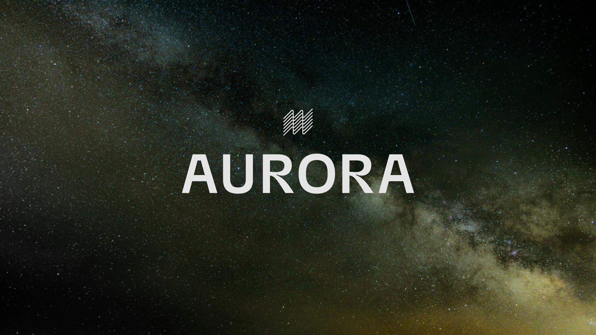
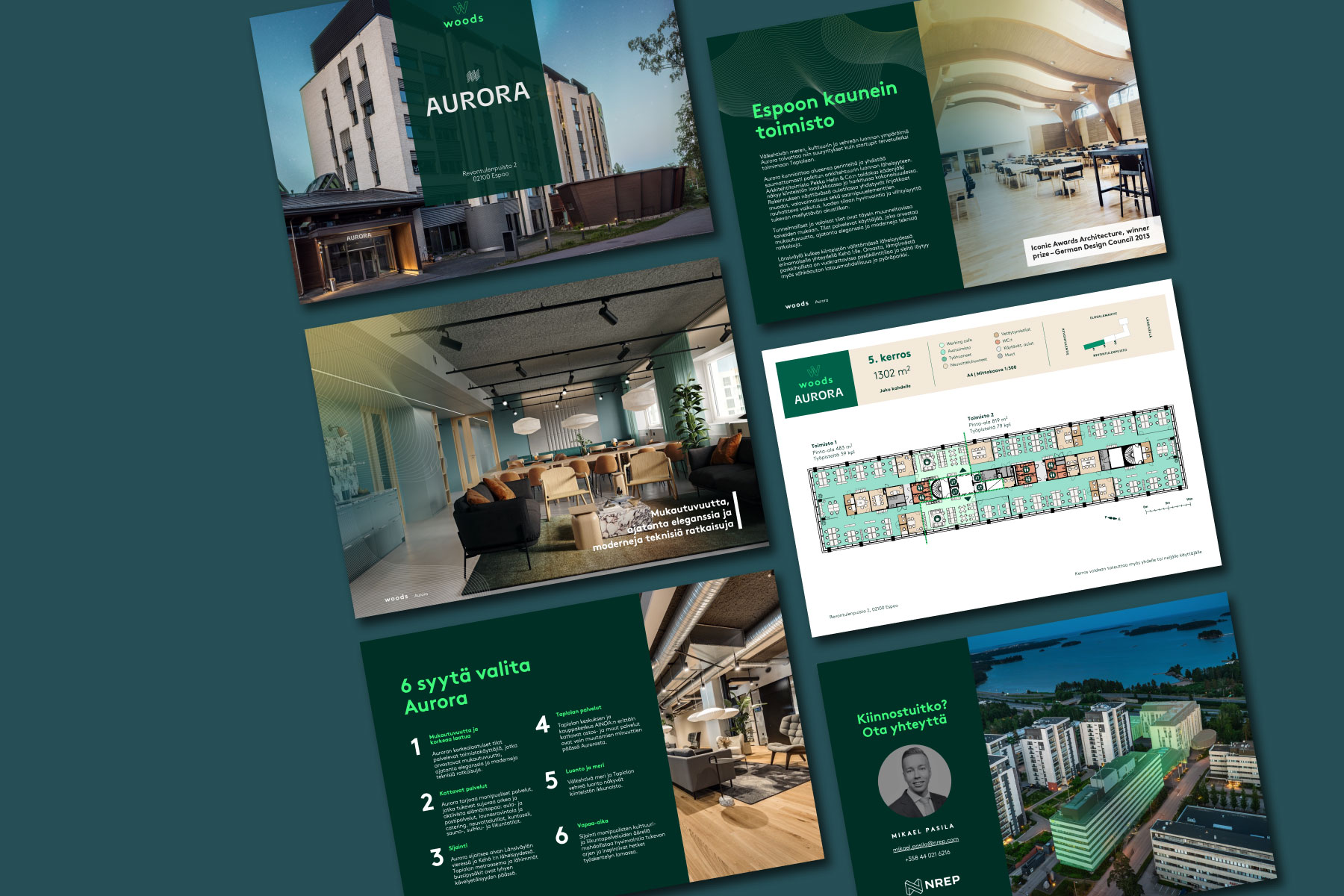
Aurora
A timeless identity supporting future transformation
Located in Revontulenpuisto 2, Tapiola, Espoo, this office property designed by Pekka Helin & co was originally built for Metsä Group and was known as Metsätapiola. In the light of the upcoming changes, the previously designed visual identity of the property requires an update – the Woods office concept by the property’s owner, NREP. The inspiring assignment began with the definition of a new name and identity for the building. The direction for the design process was further refined through a collaborative workshop.
The new name, Aurora, draws from the building’s physical location and the area’s naming conventions. The chosen name was designed to work both with and without the Woods prefix, while aligning with the essence and character of the property itself.
Our work in this project:
- Property branding
- Visual identity
- Naming and concept development
- Graphic design
- Brochure and copywriting
- Workshop facilitation
- Marketing templates
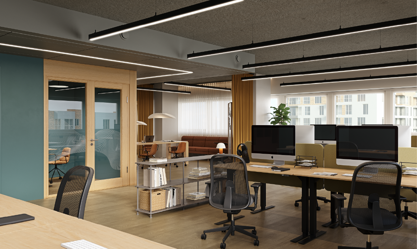
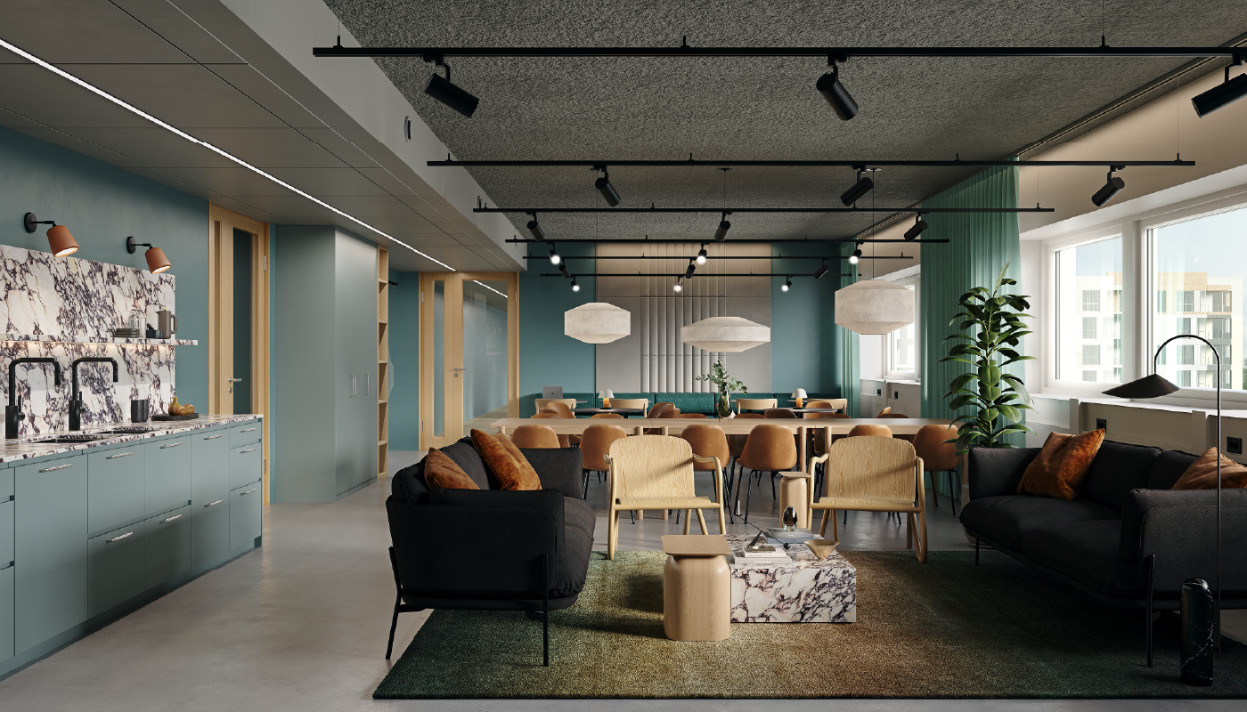
- Spatial concept
- 3D visualizations

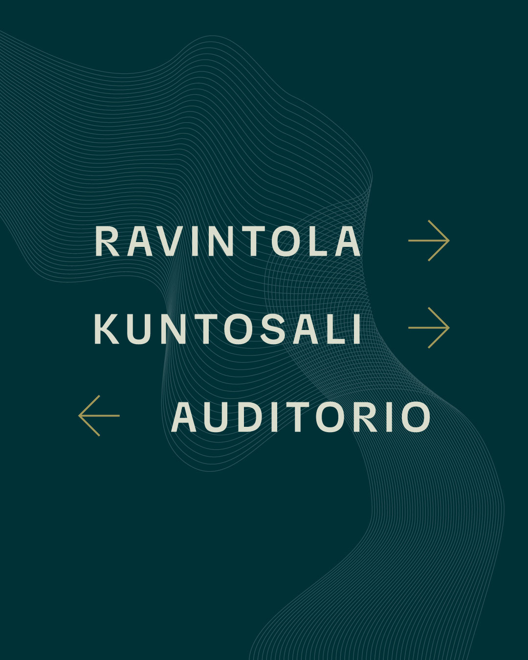
The glimmering Aurora in lush Tapiola
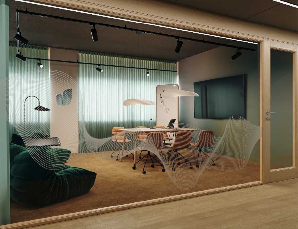
Aurora’s visual identity blends earthy tones and graphic elements that reflect the property’s new name, the surrounding area, and the striking wooden architecture of the building. The logo draws inspiration from both the architecture and the interplay between soft and sharp forms.
The visual expression is fresh and bold, yet refined and classic. The primary color, petrol blue, gives the identity a distinctive edge, supported by softer shades of green and ochre. The identity was aligned with the Woods concept through thoughtful choices in color and typography. To support Aurora and the northern lights theme, we introduced subtle gradient combinations and lightly undulating line graphics into the visual concept.
Scenario-level planning to support future transformation
The spatial studies were aligned with NREP’s Woods office concept, drawing further inspiration from NREP’s properties in Denmark.
The end result is a high-quality, characterful identity that supports the architecture of the building and will be naturally integrated into the spaces in the coming years.