Visual communication and art
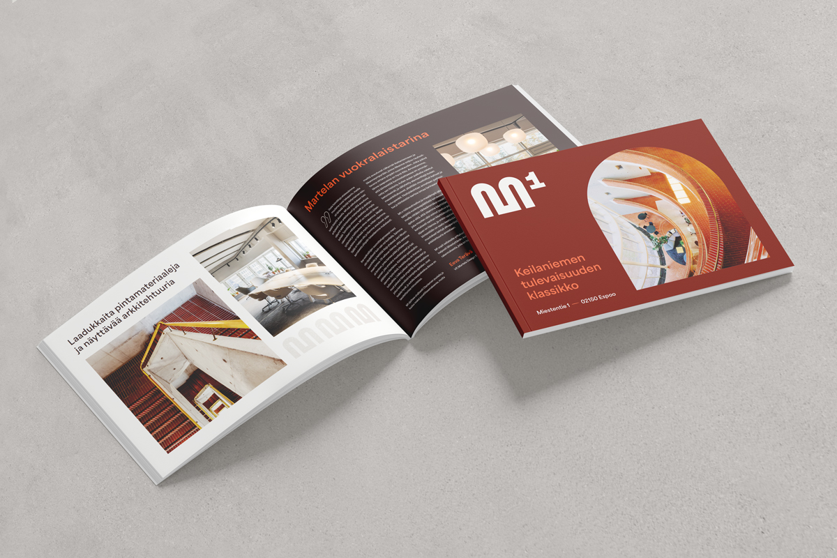
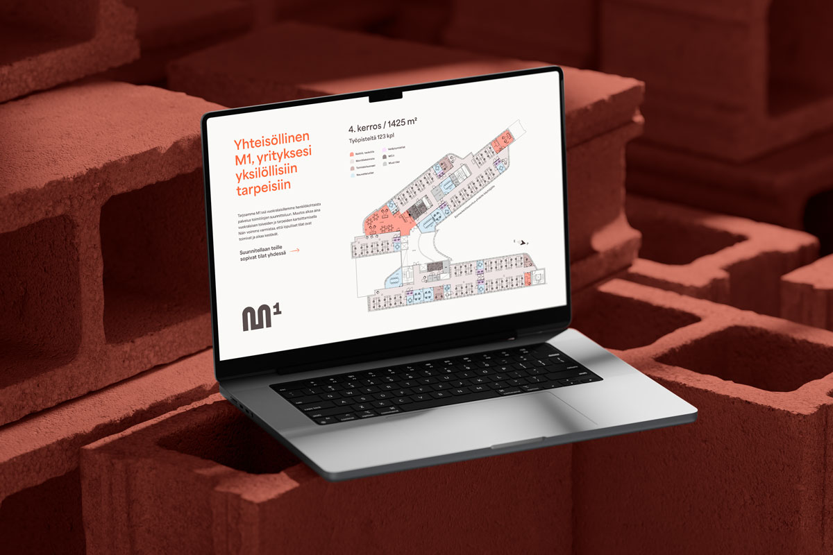
M1
Visual identity for a unique commercial property
A one of a kind property in a dynamically evolving environment
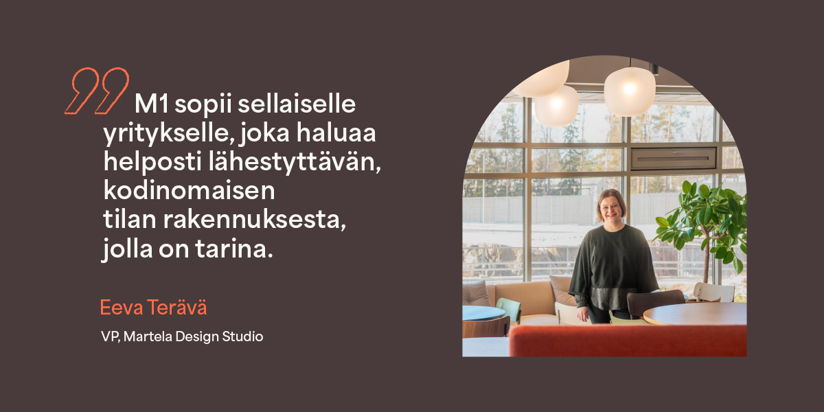
Located on Miestentie, M1 is an office property in Keilaniemi, Espoo, built in 1986 and recently fully modernized. The property serves as a stunning example of how architecture and current branding solutions can highlight a building’s unique character and stand out from other properties in the area. The refinement of the building’s identity was the result of meticulous planning, taking into account its architectural strengths and its story, which extends far into the future.
Our work in this project:
- Real estate branding
- Concept development, content creation, and copywriting
- Visual identity
- Tenant interview
- Graphic design and illustration
- Workshop facilitation
- Brochure and website
- Brand photography
- Marketing video scriptwriting

Design rooted in architectural
brilliance and a cozy atmosphere
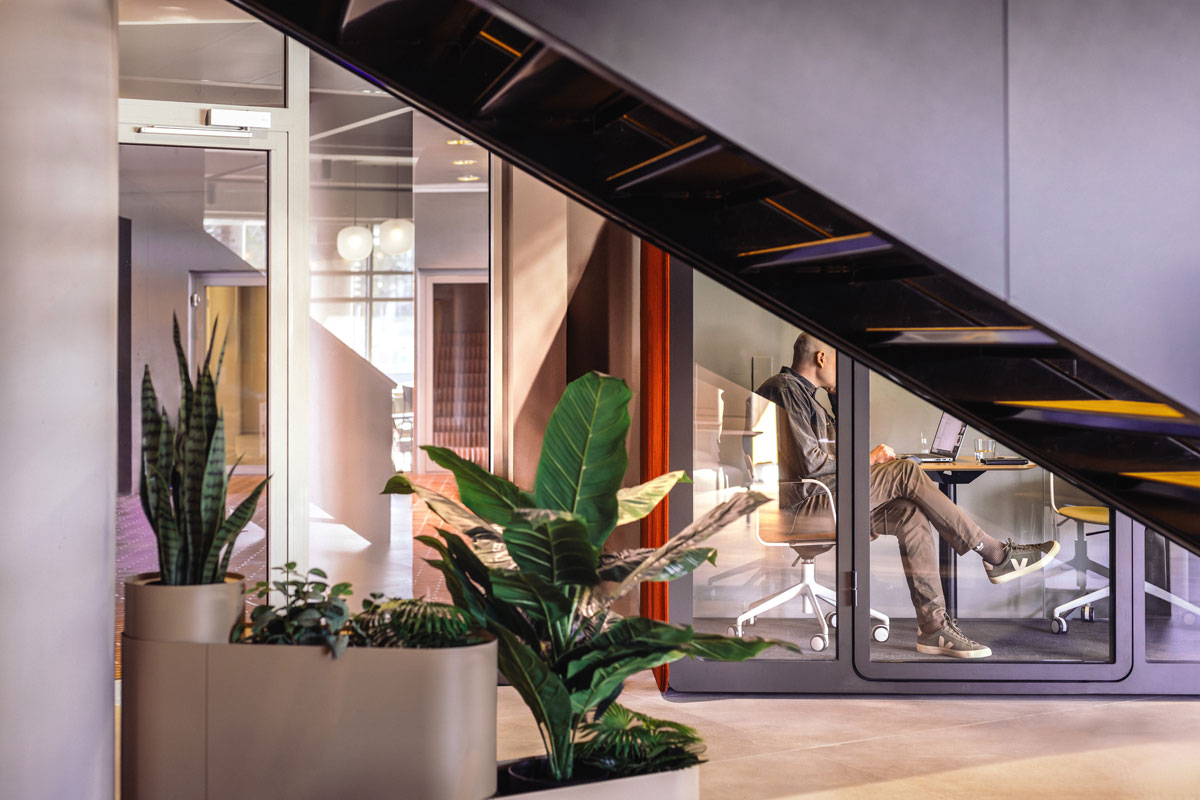
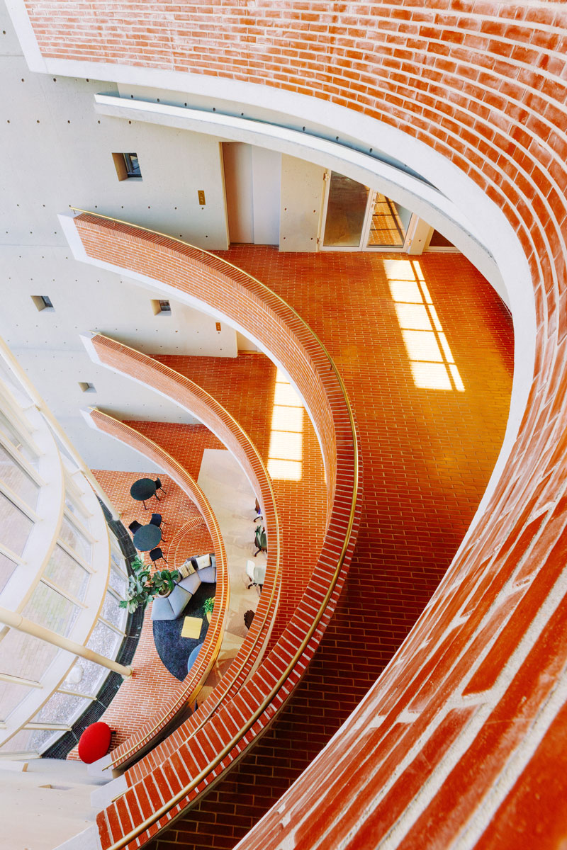
M1 is bright, inviting, and homey property that resonates with both visitors and tenants. Original details such as brass railings, hand-laid bricks, and unique stairwells create a warm and high-quality atmosphere that distinguishes it from conventional commercial properties.
M1 can rightly be called a gem of the artisan ideology, seamlessly combining sustainability, durability, and distinctive architecture.

Visual identity inspired by
the property’s defining features
The identity design process began with workshop that explored the property’s history, its role in its surroundings, and the key characteristics of the Keilaniemi area. The workshop resulted in the creation of the name M1 and a clear brand narrative, reflecting the building’s graphic lines, functional possibilities, and long-term lifecycle thinking. The property’s significant sustainability initiatives are integral to its identity, aiding tenants in their decision-making process.
The visual identity was designed to complement the building’s unique ambiance. The M1 logo’s design language mirrors the building’s rounded and streamlined shapes, while clarity is maintained in the typography, which radiates the modernized classicism of the design world. The visual identity emphasizes the interaction between the property and its users—everyone falls in love with the space.
Building on the refined identity, we designed and coordinated the creation of the website and brand photography, vividly showcasing the property’s strengths. The result is a comprehensive and visually cohesive identity that communicates the building’s uniqueness and quality.
Explore M1 on the new website ➔
Brand photography Nick Tulinen