Real estate development
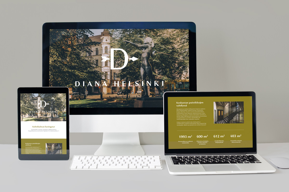
Diana Helsinki
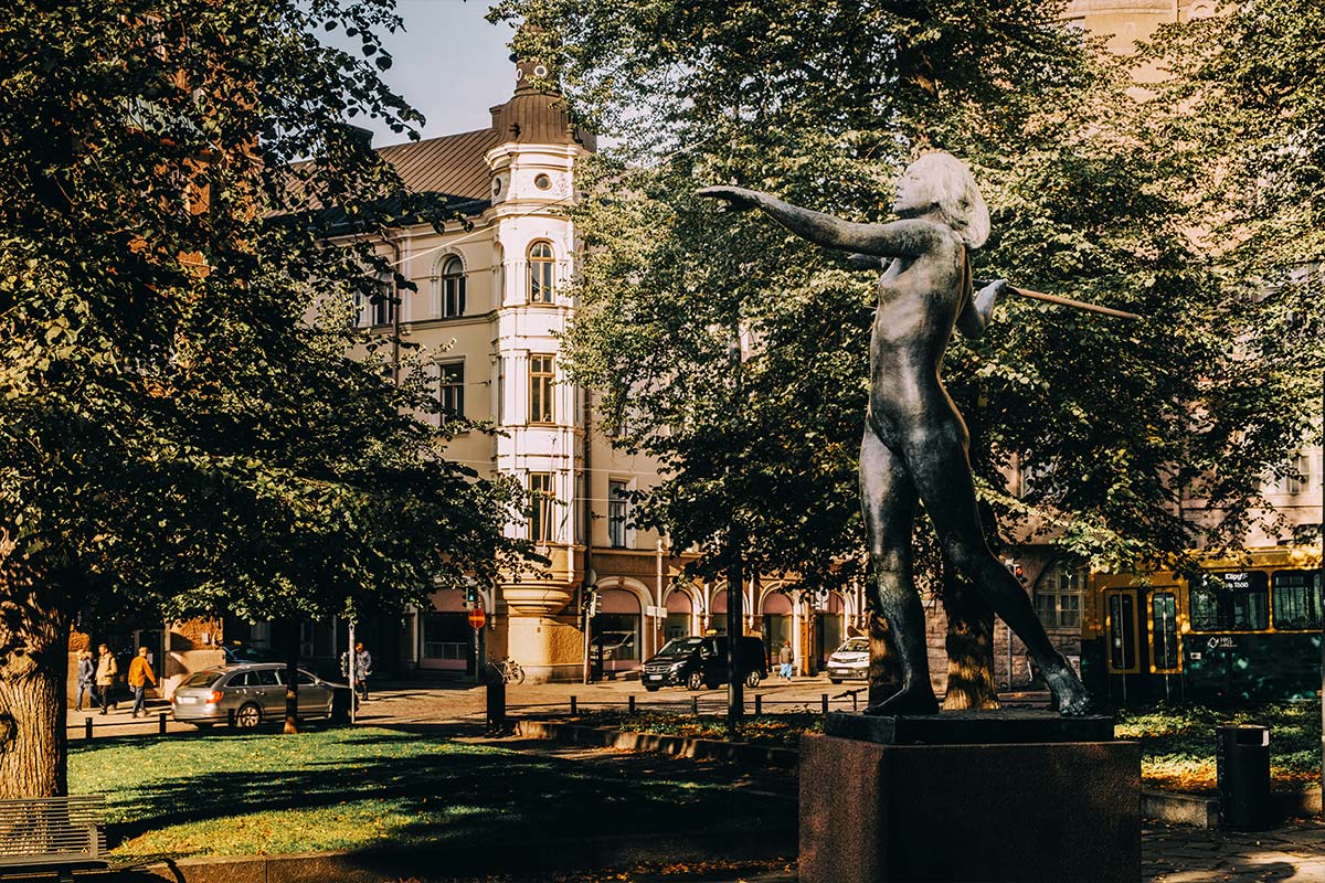
Queen of the Diana park
A comprehensive spatial concept and development project from branding to finishing touches
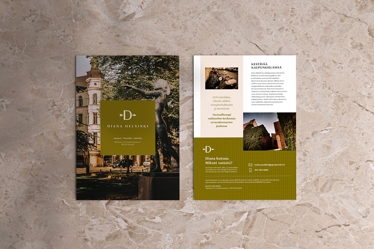
The Neo-Renaissance building, which we dubbed the “Queen of the Diana park,” underwent a transformation befitting its grandeur. We had the honor of applying our diverse design expertise throughout the project. Before the facade renovation, we captured Diana’s unique features and the surrounding park environment, which served as the foundation for the brand identity design. The logo, inspired by the bow and arrow of the goddess of the hunt, after whom the adjacent Diana park is named, became a key element. Based on the identity, we designed a brochure and website for the pre-marketing of the residential and commercial spaces, awaiting new tenants as the renovation progressed.
Our work in this project:
- Workplace concepts
- Property branding
- Website design and brochure
- Interior architecture for apartments (Silvana)
- Comprehensive interior architecture and project management
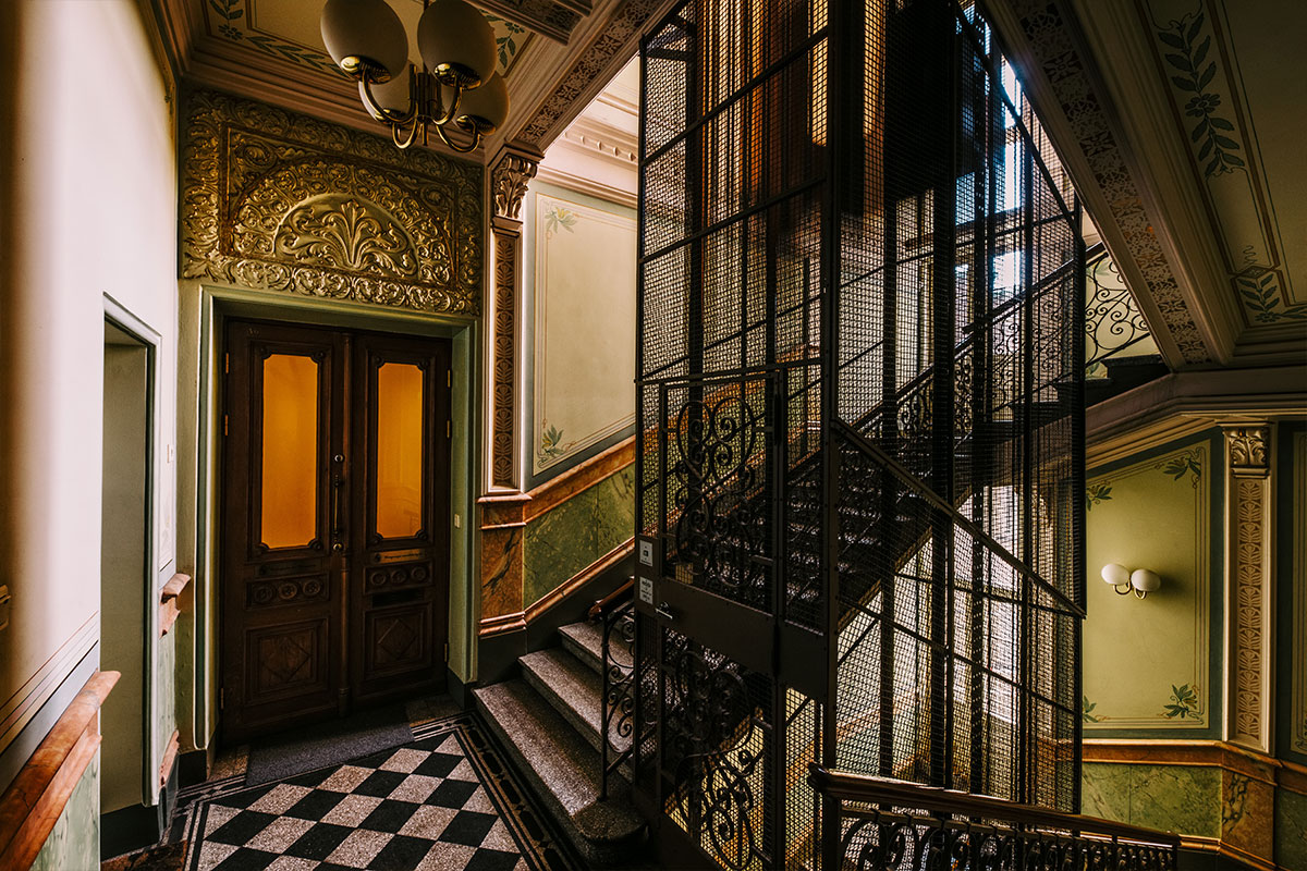
- Staircase renovations
- Lighting design
- Signage design
Sister company
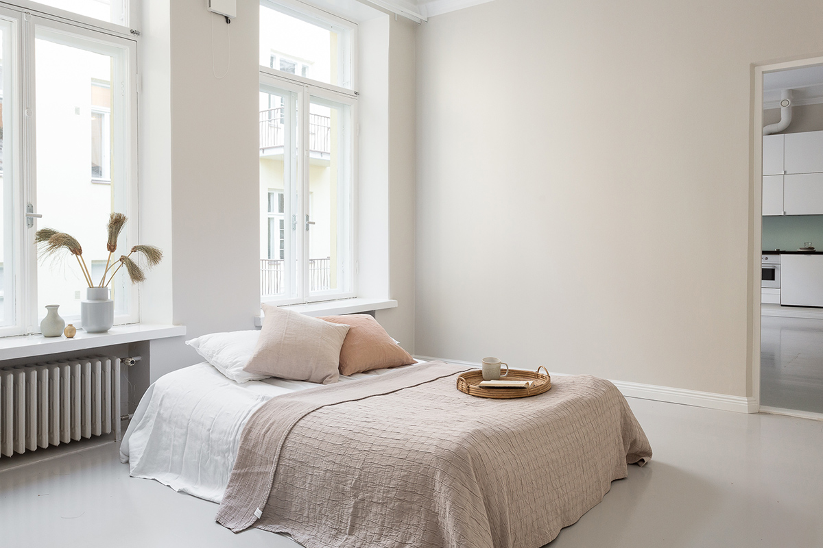
Silvana involved
in residential design
The first completed phase included high-quality rental apartments, with the interior architecture by our sister company, Silvana. The apartments were designed to meet the needs of citizens who value quality. You can read more about the design of Diana’s apartments here.
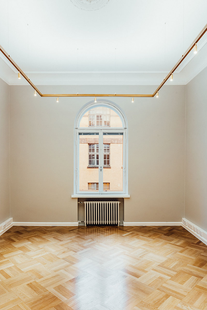
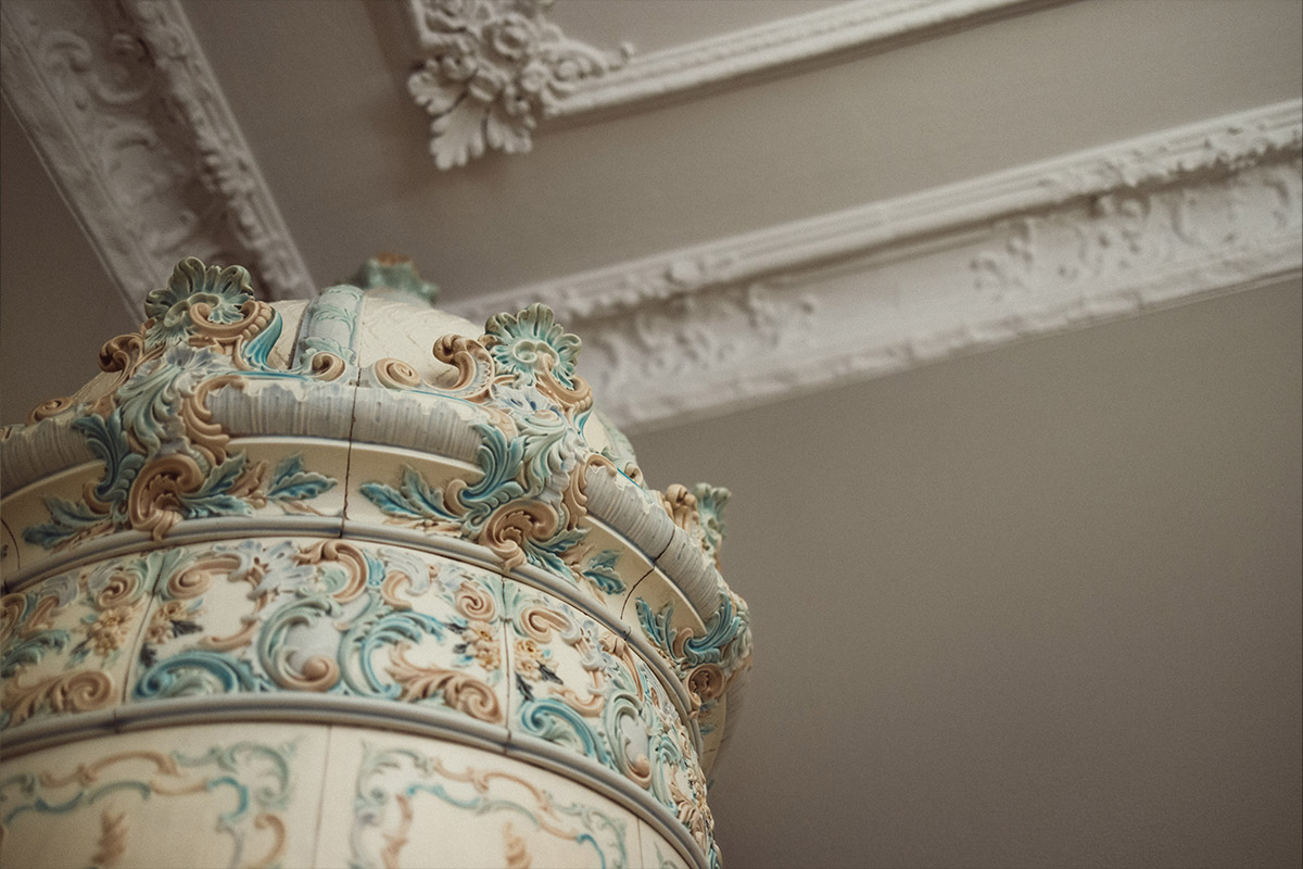
Modern technology in historic property
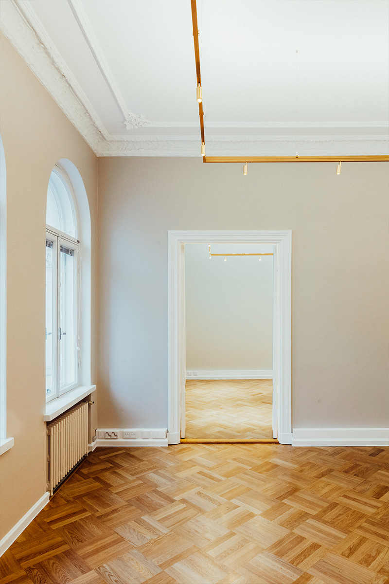
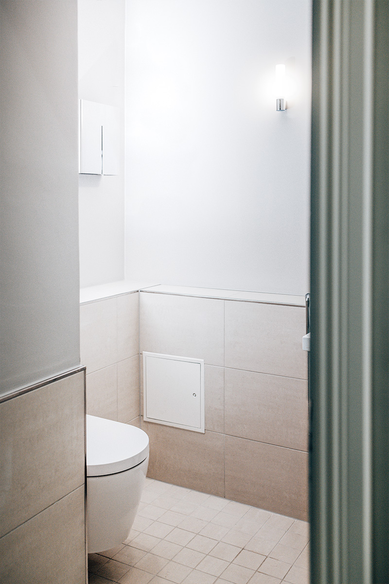
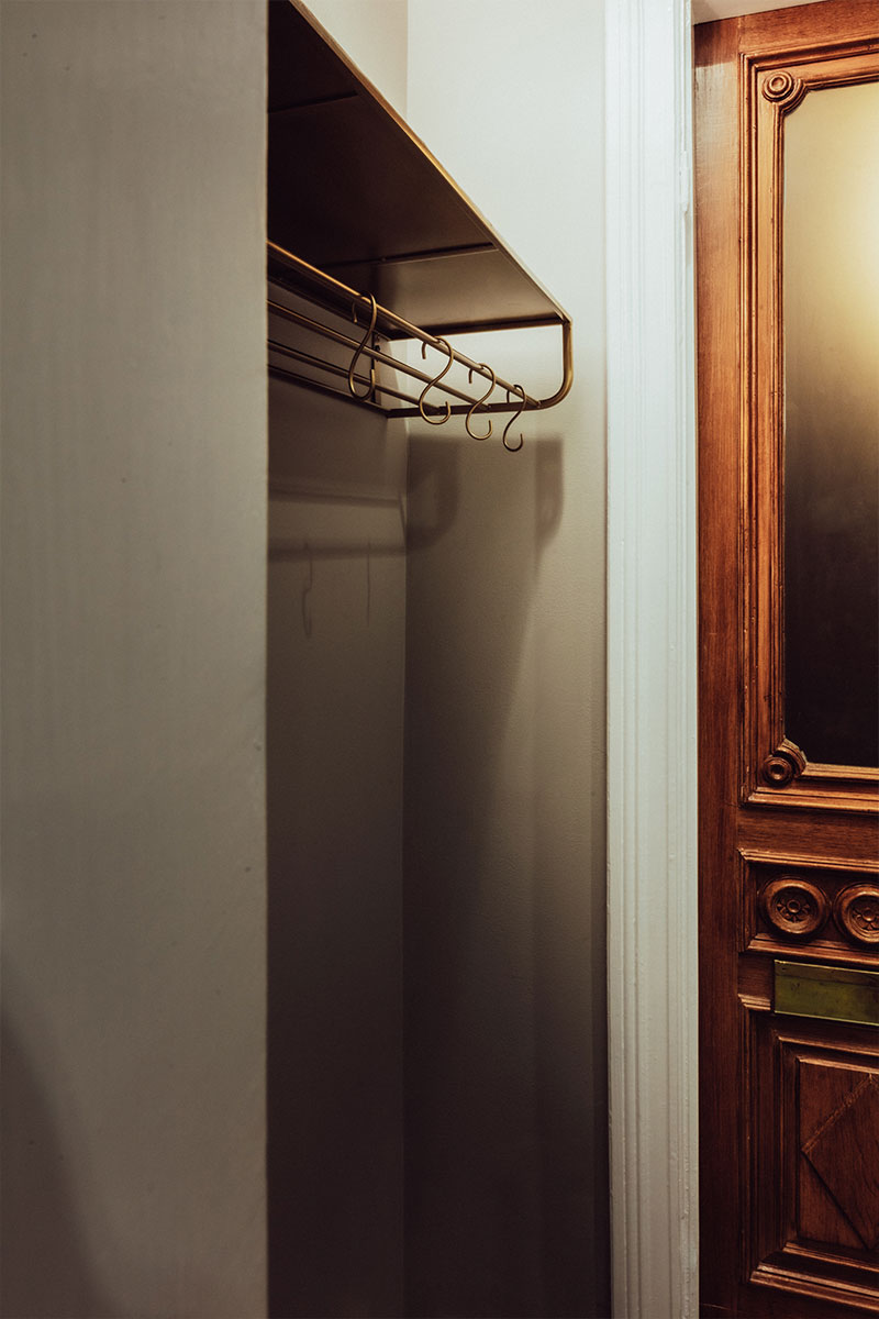
In the office suites, the aim was to preserve the original atmosphere of the historic building, complete with stucco decorations and tile stoves. However, the technology and lighting were updated to meet modern office space standards. The old parquet floors were sanded and refinished, and the walls received a fresh coat of paint. The outdated restrooms were completely renovated using high-quality materials to ensure durability for decades to come.
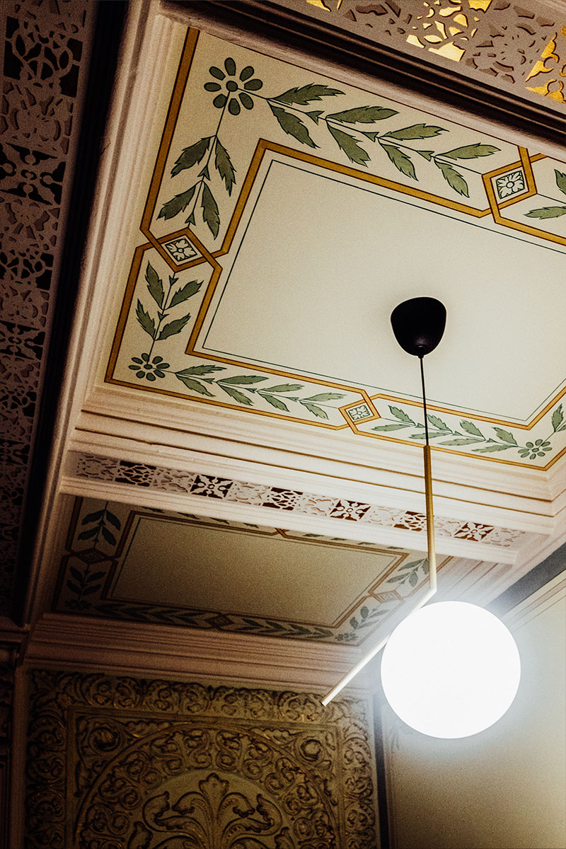
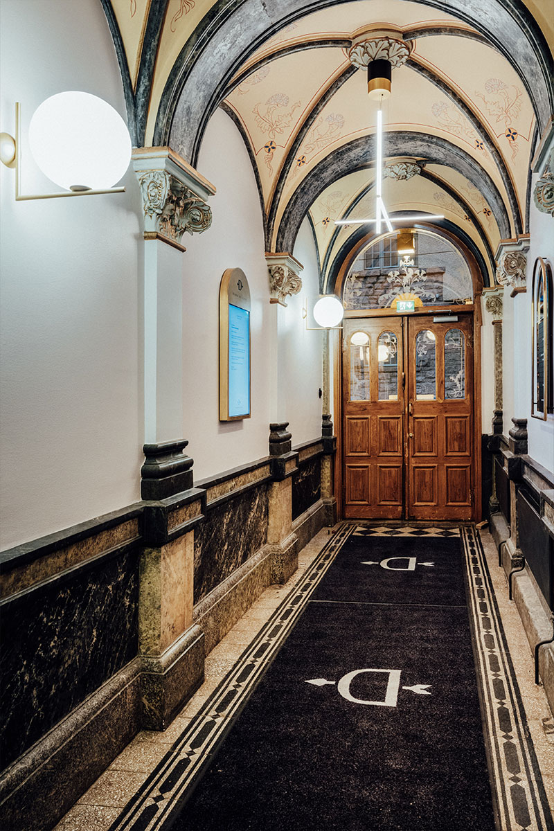
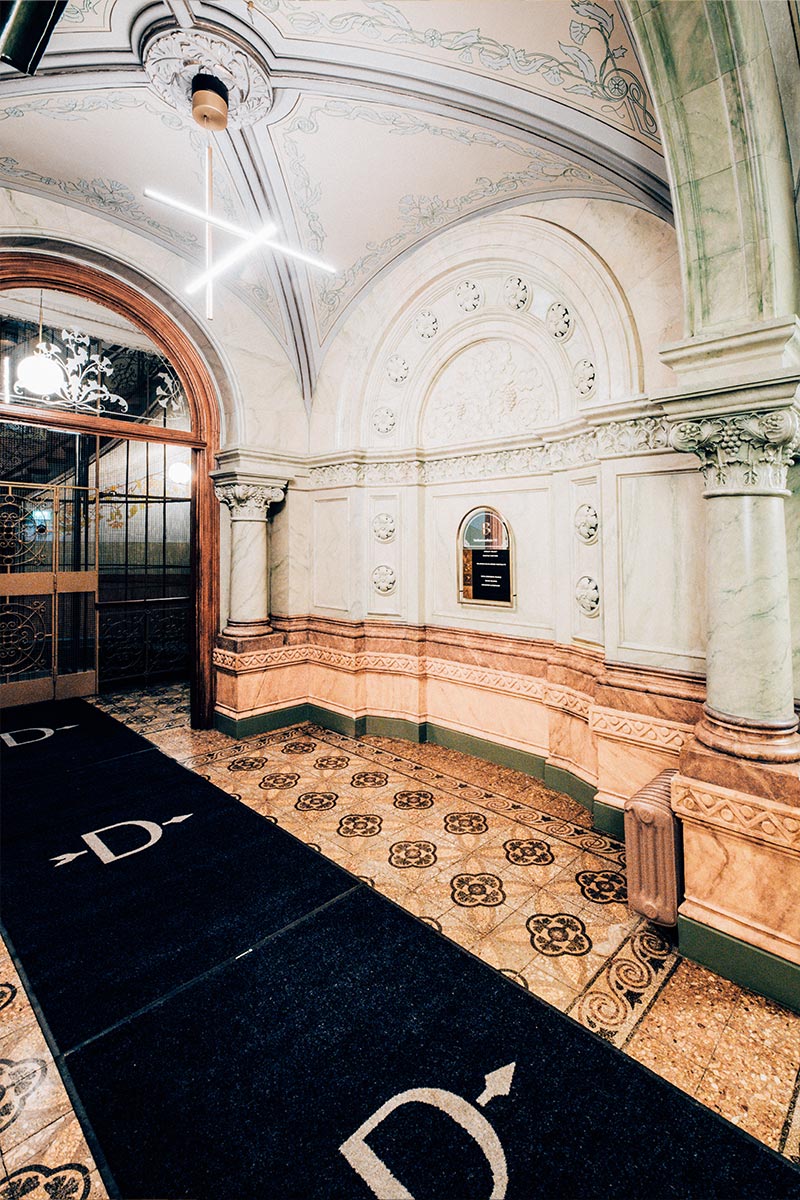
In the stairwells, we introduced striking lighting fixtures with modern forms that contrast beautifully with the decorative ceilings and walls. Worn surfaces were refreshed with fresh paint, and the outdated light switches were replaced, restoring Diana to its former glory down to the smallest detail.

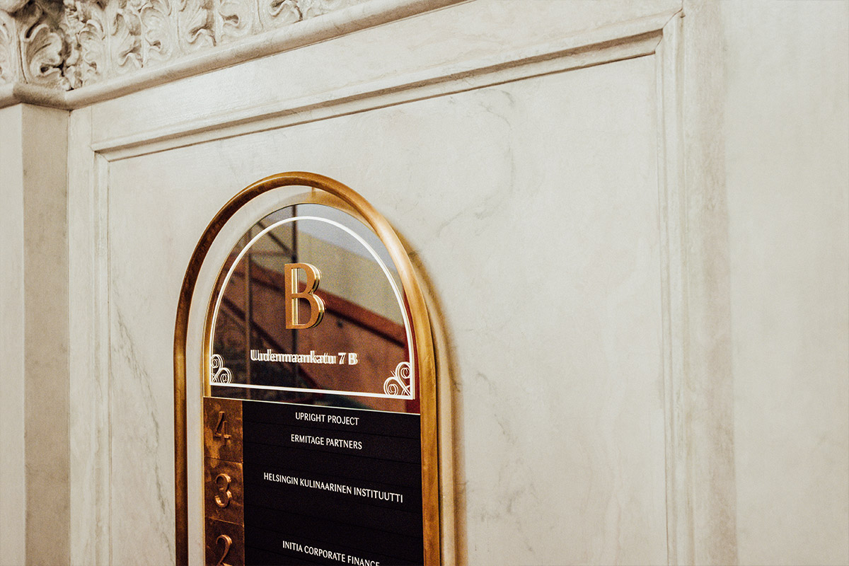
New brand identity as part of the building
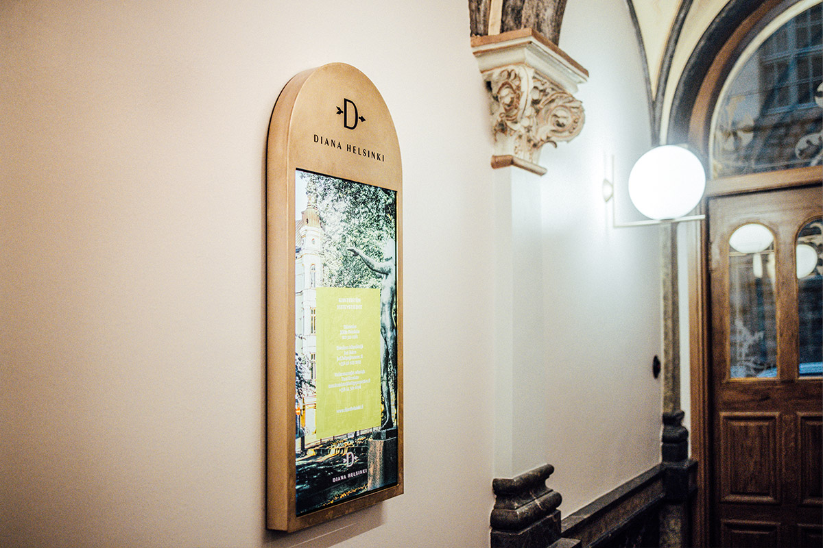
In the signage design, Diana’s new brand identity was seamlessly integrated into the building. The shapes and material choices for the signs and plaques reflect the ornate style of the stairwells. Even the digital displays were encased in brass to better harmonize with the antique surroundings.
The high-quality execution of the signage ensures that it will age gracefully, in line with Diana’s timeless elegance.

Sustainable property development
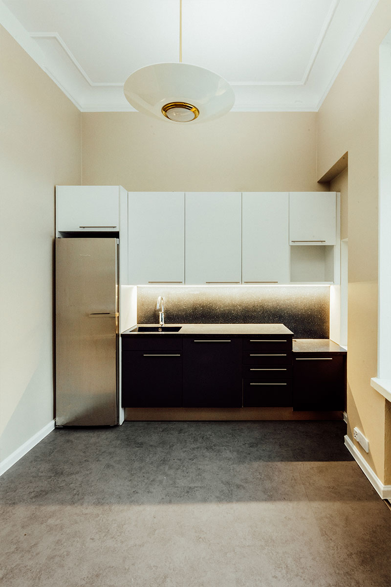
All design work was guided by the strong environmental values of the property owner, which led us to carefully consider the necessity of renovations, the durability of materials, and energy-efficient solutions. For example, kitchens in the residential and office suites were not updated if the fixtures were intact, functional, and in good condition.