Visual communication and art
Ilmalan Aura
How can we describe the atmosphere of a building, when even the cornerstone is yet to be laid?
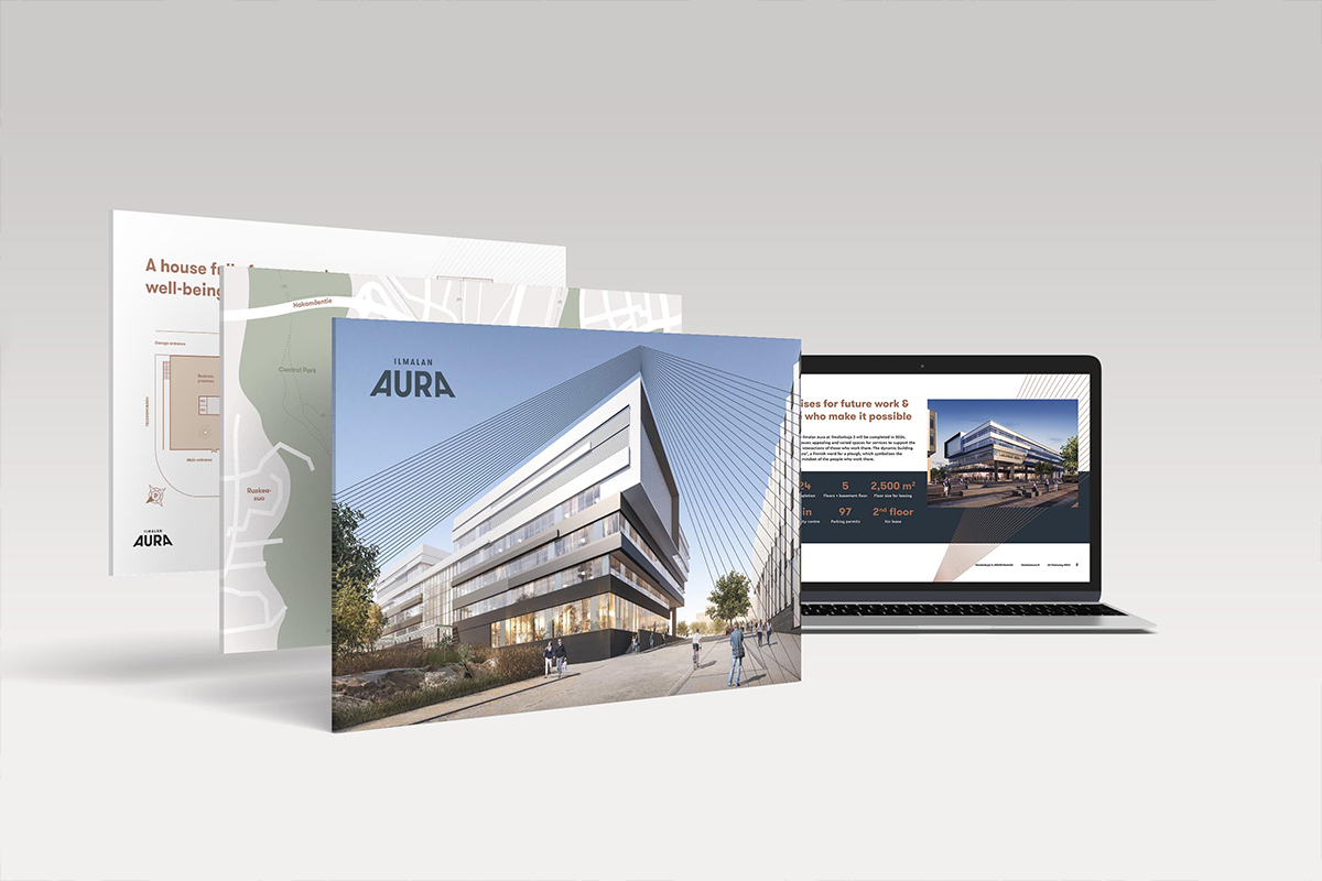
This was the premise when we started a property branding project with Hartela, a Finnish construction company strongly involved in developing the Ilmala neighbourhood.
Our work in this project:
- Property branding
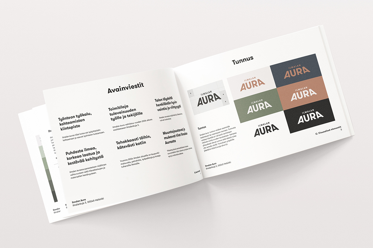
- Visual identity
- Graphic design
- Workshop facilitation
- Brand photography
- Concept development and content creation
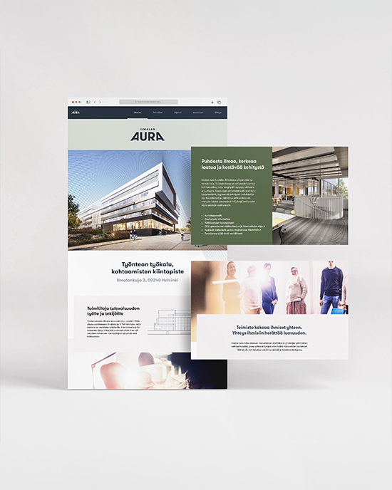
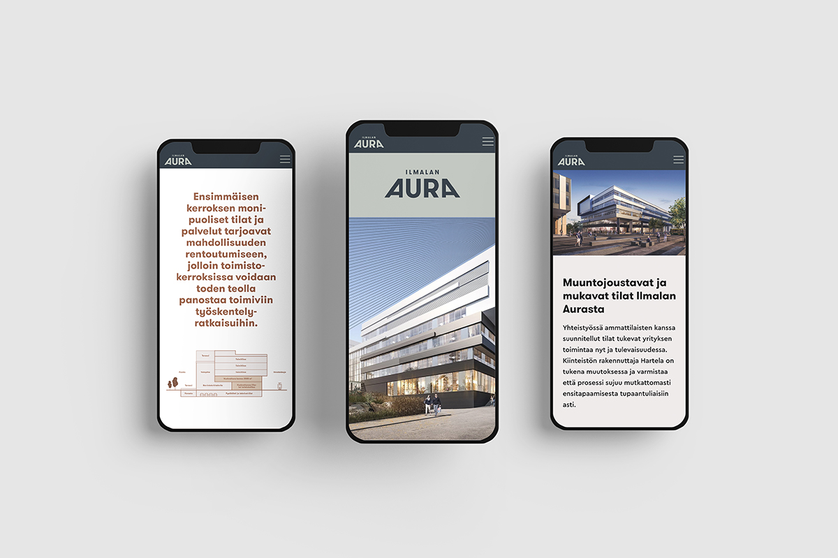
- Web design
In workshops, we dug deep into Hartela offices in general as well as the development project in question. We also had discussions with the architects to get a thorough understanding of the ideas behind the design. Hartelas objectives, architects’ vision and the tenants’ needs laid the foundation for the brand, which we concretised into verbal and visual messages. After weighing several different options, we named the property Ilmalan Aura (aura = plow in Finnish). The name reflects the dynamic and propellant design as well as Hartela’s ambition to create a forward-thinking base for future work life.
Photos bringing warmth to marketing materials
Get to know Ilmalan Aura ➔
Brand photography by Nick Tulinen
Kakadu’s passion is to help the client succeed and prosper. Their merit is definitely agility in changing conditions, schedule management, a fresh approach and looking at things from different angles. There were some setbacks in the process, but they always cheered us on. Kakadu is definitely on the client’s side.
Tea Hakala, Customer service engineer, Hartela
