Visual communication and art

Polaris

Brand revitalization for a commercial property

Radiant atmosphere and enhanced user experience for a trio of properties

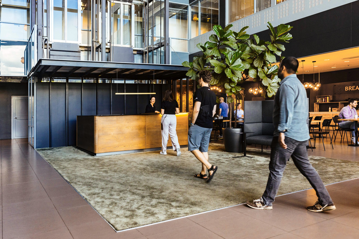
The Polaris office property in Espoo was in need of a refreshed identity. The complex, which consists of three neighboring properties, needed its own narrative to highlight the spaces’ strengths: the potential for warm and welcoming interiors wasn’t clearly conveyed to potential tenants. Additionally, the existing website was outdated both technically and in terms of content and needed a clearer structure. Polaris sought a partner to provide comprehensive support for marketing and leasing efforts – Kakadu eagerly stepped in to answer the call.

Our work in this project:

  • Property branding
  • Visual identity
  • Graphic design
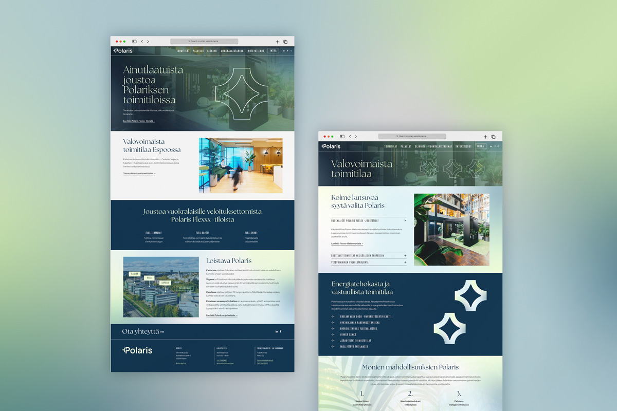
  • Website design
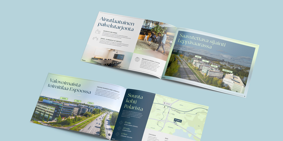
  • Brochures and marketing materials
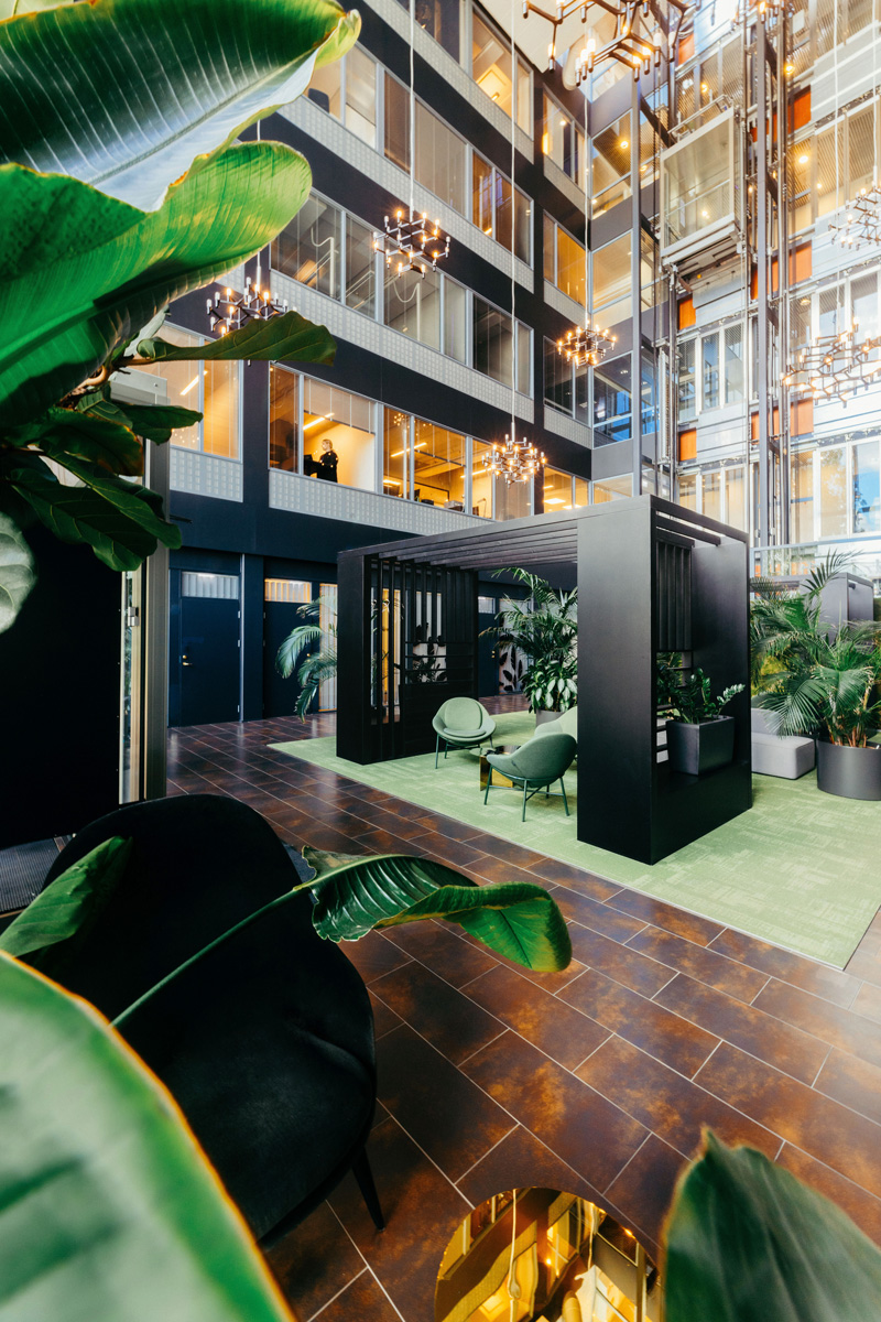
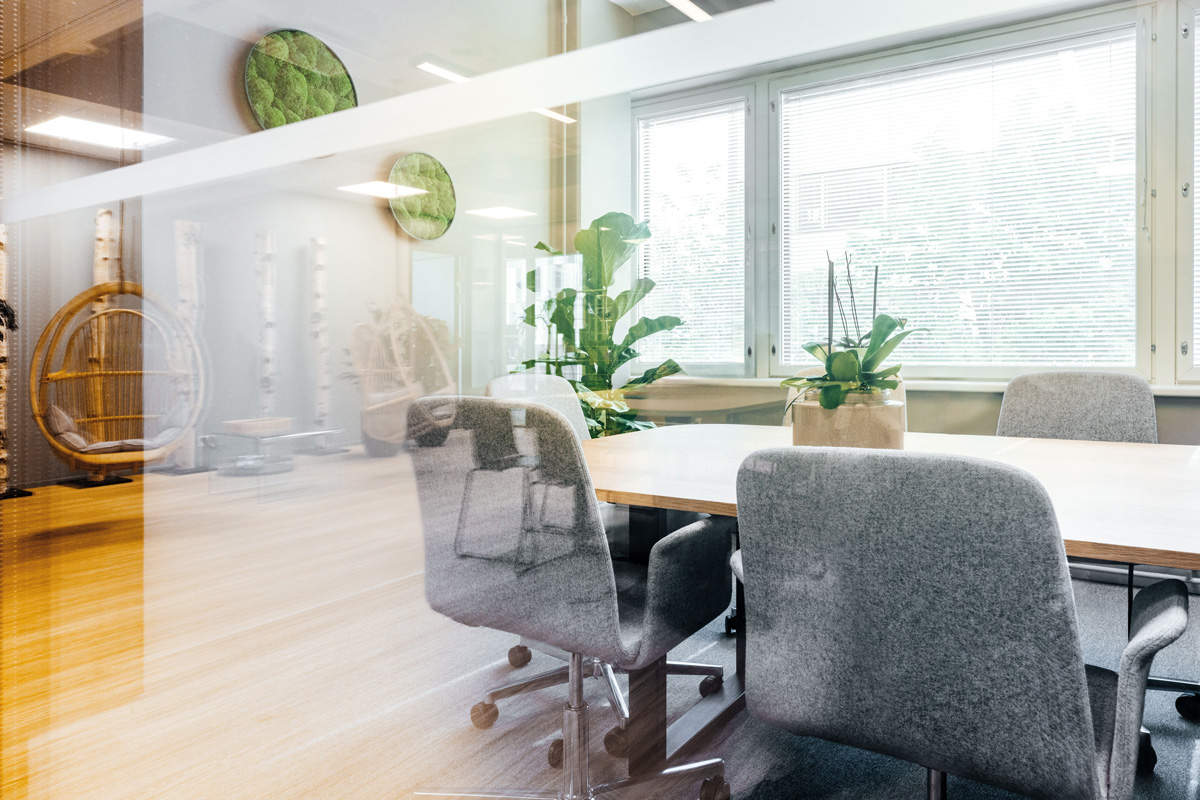
  • Brand photography
  • Workshop facilitation

A fitting name inspired
by a three-star constellation

The brand refresh began with an collaborative workshop that clarified the property’s unique attributes, defined the visual direction, and established a verbal concept for the brand. The new identity was shaped by keywords such as elegance, freshness, warmth, and clarity. The existing name, Polaris, was retained since the trio of buildings named after a three-star constellation was already fitting. The bright and striking lobby spaces, along with the individual property names referencing stars, tied the whole concept neatly under a celestial theme.
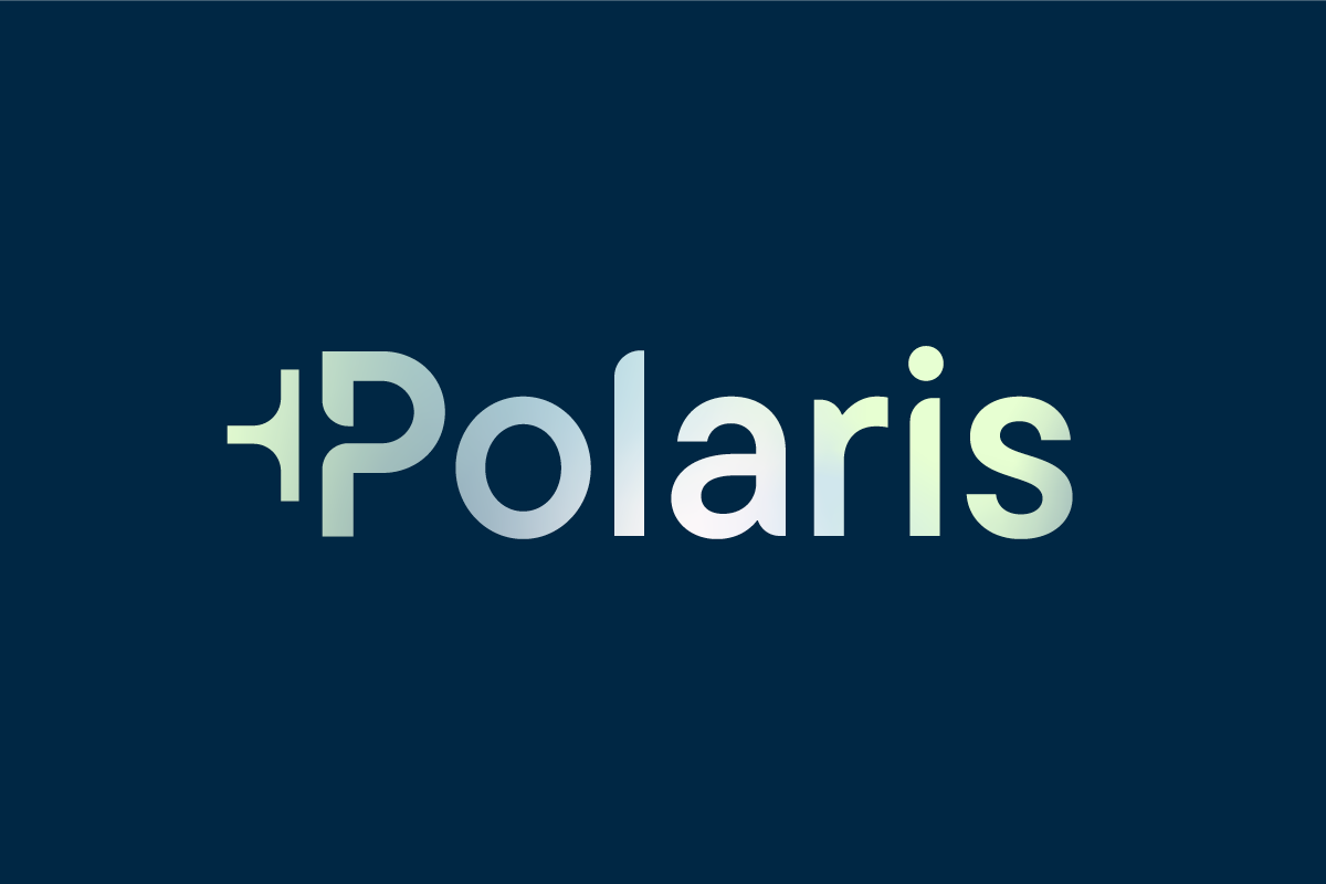
This theme inspired the visual identity. The gradient effect in the design drew from the multicolored starry sky, galaxies, and stardust, creating a vibrant, versatile visual element used in overlays, backgrounds, the logo, and animations. In the new logo, the star motif is subtly incorporated through clever use of negative space. The typography is stylish and airy, yet approachable and clean in form. These elements, together with updated brand imagery, convey the same ambiance and warmth in the visual identity that the properties offer within their walls.

A visually striking design that captures
the essence of the properties

A clear brand style guide was created from the updated identity, and the new look was applied to the website and marketing materials, including brochures and press templates. The primary goal of the website design was to create a clear, functional, and informative site where key information could be easily and quickly accessed.
The result was a cohesive and visually impressive brand identity that beautifully reflects the character of the properties. The website and new look have been well-received, earning positive feedback from users.

Visit Polaris’ redesigned website ➔

Brand photography by Nick Tulinen