Visual communication and art

Premico

A unified brand identity for the entire life-cycle of real estate business

Clear visual materials and core messages reflect the company’s values

Timelessness, thought leadership, responsibility, and quality are the attributes for which Premico is known. Their business, operating in Finland for decades, covers the entire life cycle of property development, from property investment to construction and rental housing.

Premico wanted to identify a coherent approach and core messages for its visual communications. Every sales slide, promotional material and presentation graphic should tell a collective real-life story about Premico. In the past, their employees used several parallel versions of the materials at the same time.

Our work in this project:

  • Visual identity
  • Brand refresh
  • Graphic design
  • Brand illustration
  • Presentation templates and internal materials design

Softness, human connection, and expertise

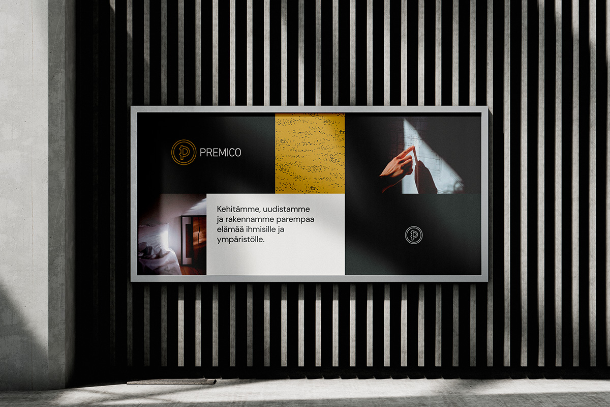
We began sharpening the company’s identity by gathering all of Premico’s existing visual elements in use. We engaged in open dialogue about which messages and differentiators best contribute to the desired brand image, and based on these discussions, we proposed a new color palette, visual style, and graphic elements.

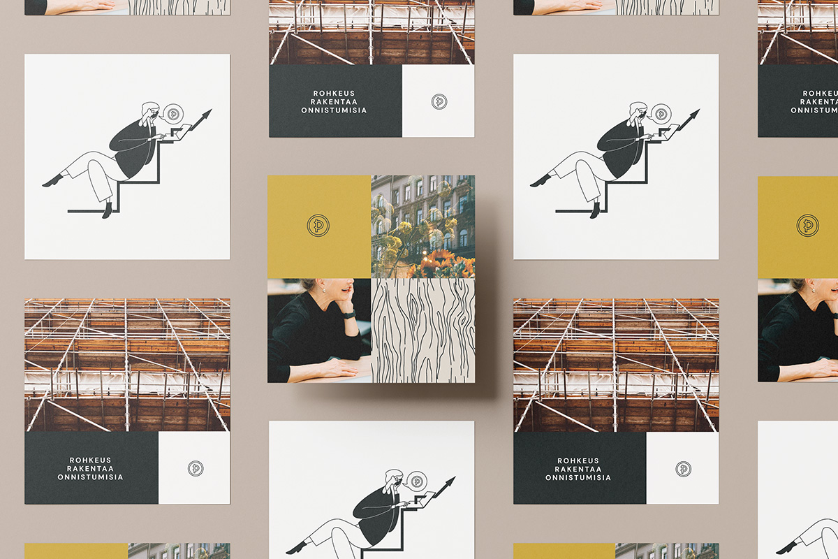
Each choice was guided by the idea of softness and people orientation, combined with sharp expertise. Dark yet warm colors and photographs, together with a humane sans-serif font, create a recognizable visual world.
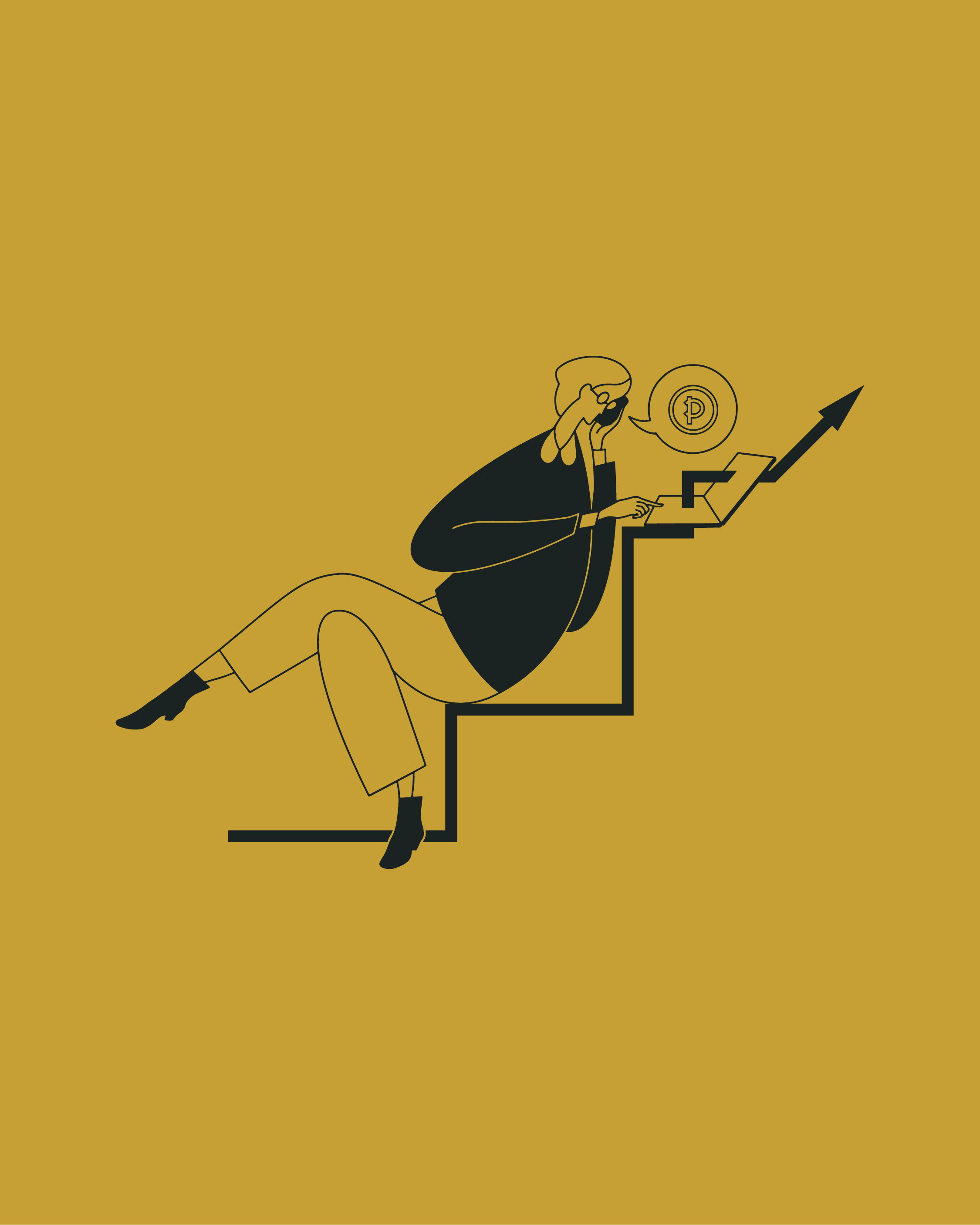
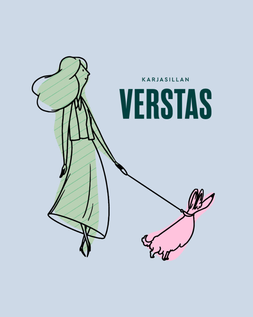
The artwork of Kakadu’s own illustrator added a new element to the entity. The hand-crafted textures and figures give a personal touch that helps Premico stand out in the market. Patterns and smart cartoon characters allow for subtle distinctions to be made between different business focus areas, for example in sales materials.

The updated graphic guidelines
set out clear advice for communication

Premico wanted ready-to-use materials that work in any situation, every working day, for any Premico employee. For example, the easier it is to use presentation slides or embeddable graphs, the more time will be saved.
You don’t always have to start from scratch. In this project, a number of proven elements were used as building blocks, from which the most essentials were highlighted. The budget and timeframes were clear and stuck to the plans.
Competition is intense in the real estate sector. A strong visual organizational identity is memorable because it signals what truly differentiates a company in the market. Brand image is the sum of visual identity and key messages, and that whole needs some nurturing and care.
With a clear look and effective tools, Premico leads the way one step ahead – as promised in its values.