Visual communication and art
Rake
Visual identity and brand renewal for a real estate and investment company
Clarity and airiness to a company with a long and rich history
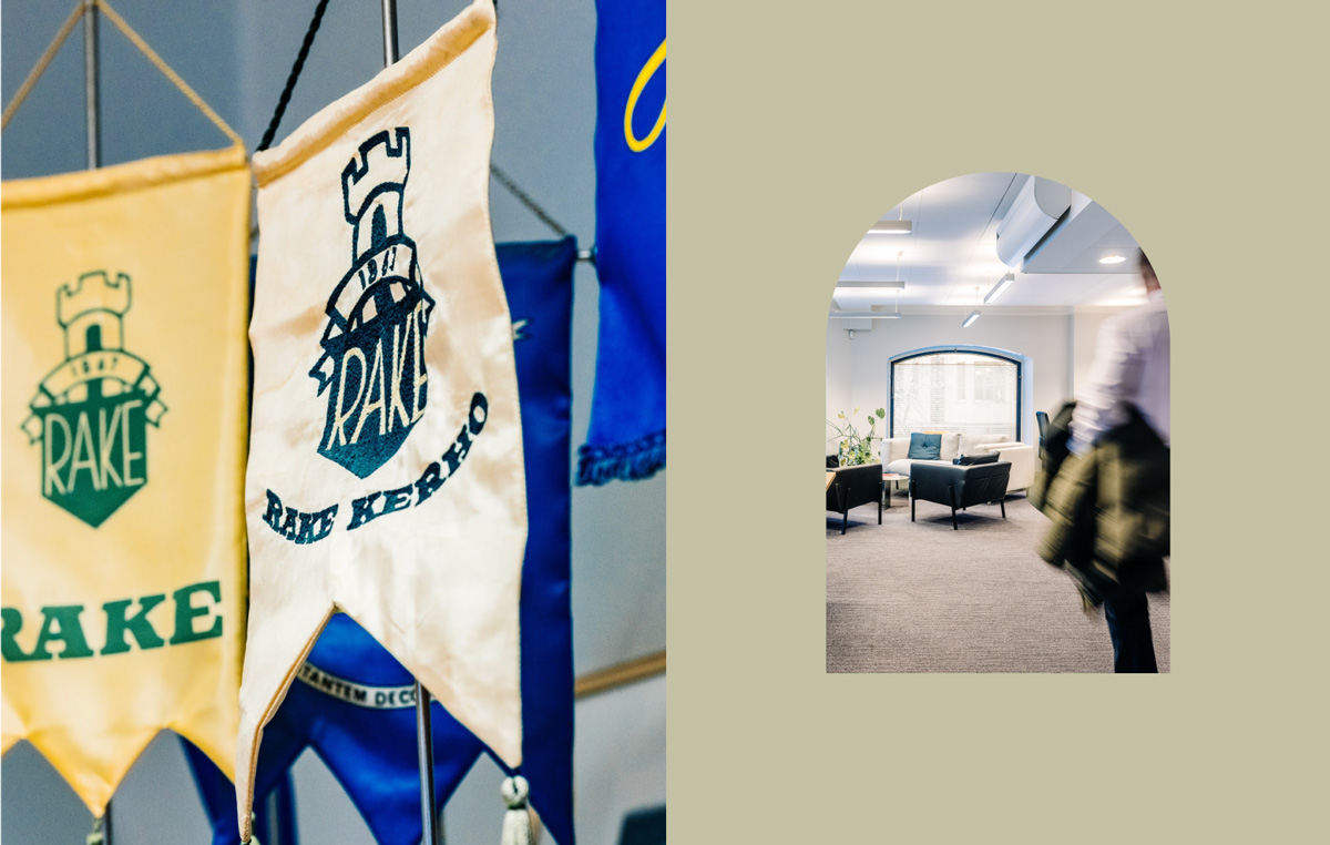
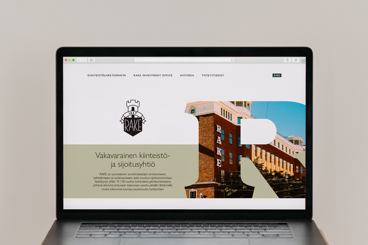
We had the pleasure of pausing to refresh the visual identity of Rake, a family-owned real estate and investment company, and to clarify its brand. Rake, a financially stable company with a long-term business approach, has a valuable and rich history that stretches back to the 19th century. In our design process, we were inspired by both the layers of this history and the possibilities for the future.
Our work in this project:
- Visual identity
- Brand refresh
- Graphic design
- Web design
- Brand photography
Curiosity and timelessness
at the heart of visual choices
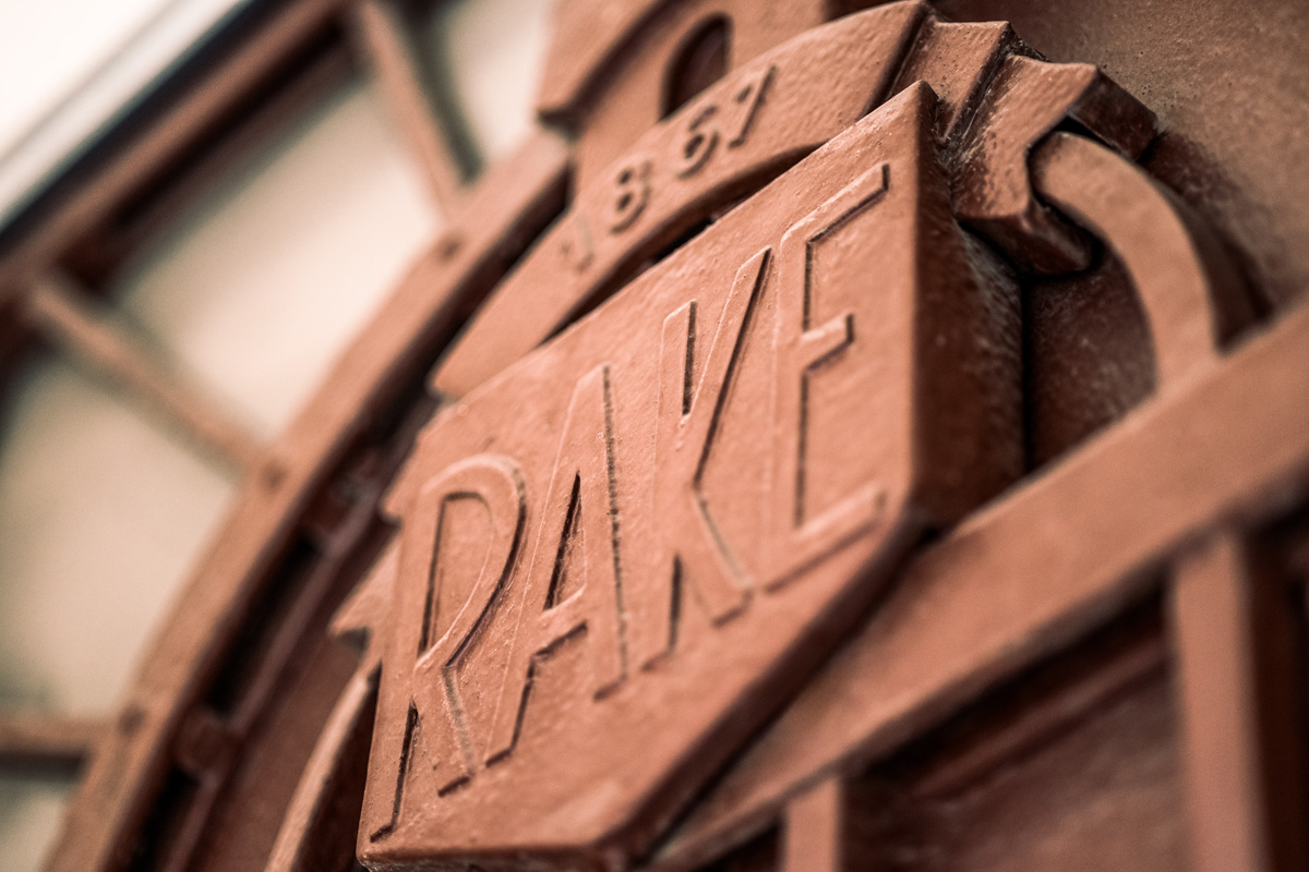
At the core of Rake’s real estate business is the stunning Bulevardin Kulma property complex. Our iterative design process naturally began with a workshop in the park-like environment of Bulevardi, which offered inspiration for the visual choices. The colours, shapes of the design elements, and wood imagery symbolize not only the property but also Rake’s long history, ongoing development, and growth. Through these visual choices, we aimed to communicate curiosity, timelessness, clarity, and tradition, which were also reflected in the company’s updated website.
The result of our work was a fresh, new visual identity, a modern and up-to-date website, and high-quality photographs showcasing the real estate operations and staff. The new identity reflects Rake’s agile business model and its forward-looking approach.
Brand photography by Nick Tulinen
