
Clear visual materials and core messages reflect the company’s values
Timelessness, thought leadership, responsibility, and quality are the attributes for which Premico is known. Their business, operating in Finland for decades, covers the entire life cycle of property development, from property investment to construction and rental housing.
Premico wanted to identify a coherent approach and core messages for its visual communications. Every sales slide, promotional material and presentation graphic should tell a collective real-life story about Premico. In the past, their employees used several parallel versions of the materials at the same time.
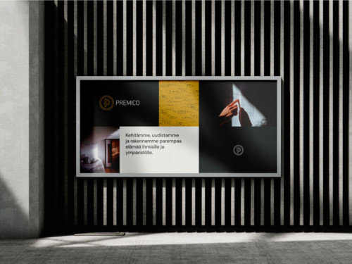
We started to sharpen the company’s identity by first bringing together all the existing visual elements Premico had in use. We then held an open dialogue on which attributes and differentiators would best lead to the desired brand image and used them as a basis for designing a new color palette, imagery, and graphic elements.
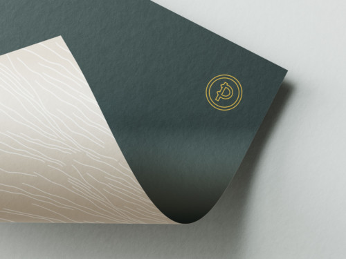
Each choice was guided by the idea of softness and people orientation, combined with sharp expertise. Dark yet warm colors and photographs, together with a humane sans-serif font, create a recognizable visual world.
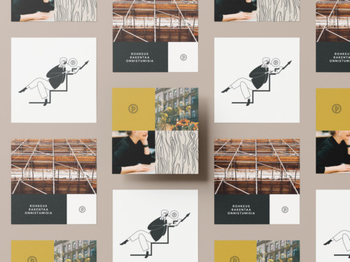
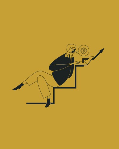
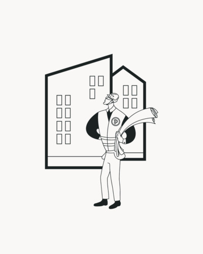
The artwork of Kakadu’s own illustrator added a new element to the entity. The hand-crafted textures and figures give a personal touch that helps Premico stand out in the market. Patterns and smart cartoon characters allow for subtle distinctions to be made between different business focus areas, for example in sales materials.
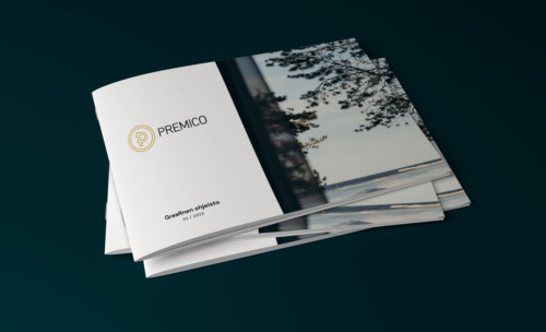
The updated graphic guidelines set out clear advice for communication. On top of that, Premico wanted ready-to-use materials that work in any situation, every working day, for any Premico employee. For example, the easier it is to use presentation slides or embeddable graphs, the more time will be saved.
You don’t always have to start from scratch. In this project, a number of proven elements were used as building blocks, from which the most essentials were highlighted. The budget and timeframes were clear and stuck to the plans.
Competition is intense in the real estate sector. A strong visual organizational identity is memorable because it signals what truly differentiates a company in the market. Brand image is the sum of visual identity and key messages, and that whole needs some nurturing and care. With a clear look and effective tools, Premico leads the way one step ahead – as promised in its values.
For a Functioning City
We were more than excited to be approached by experienced real estate developers in search of a partner for identity design. Our wide understanding of the real estate market was our strength when they selected us to help create an identity for their new company.
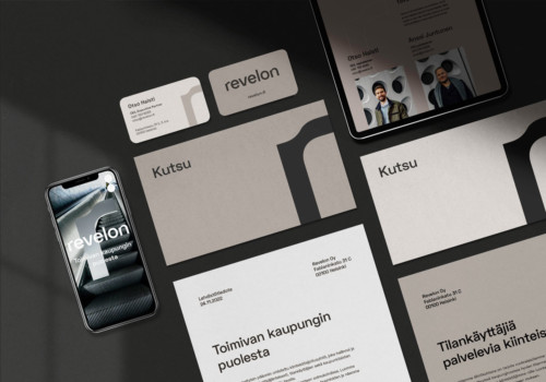
Our approach is to begin each project with workshops. In the first one, we dug deep into the company’s functions and services as well as its values and purpose. The second workshop took the design process further toward visual communication and core messages. Workshopping also helped name the new company Revelon.
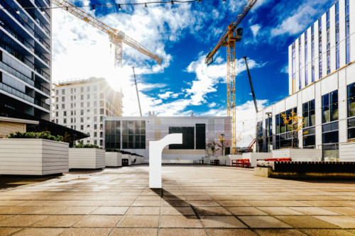
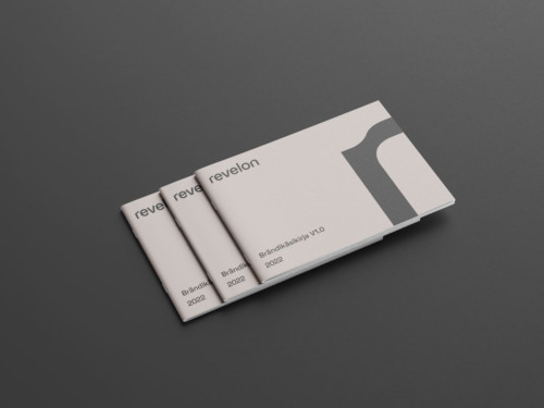
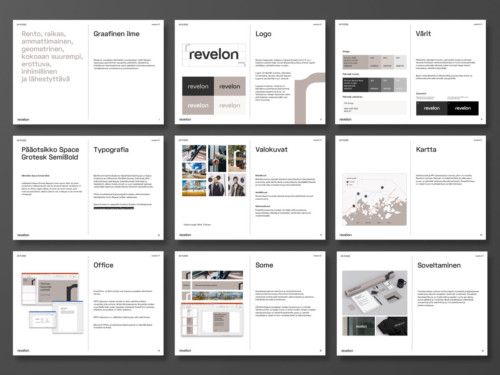
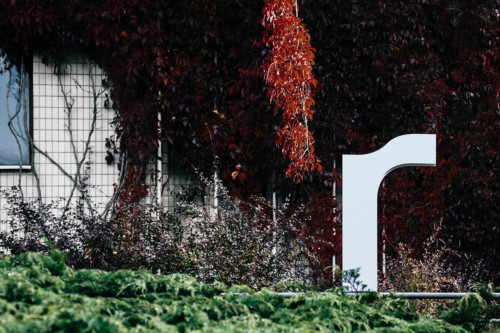
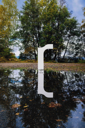
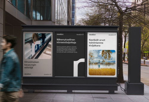
We defined keywords to support identity design: casual, professional, geometric, humane, and approachable. By combining a few sketches we created a visual identity, that is built around strong typography and a harmonious color palette. In brand photos, Revelon’s R stands in a developing urban setting, surrounded by nature.
Clearly defined processes and schedules framed the project, which went on purposefully from the beginning to the end. Mutual trust, understanding, and the client’s decisiveness helped achieve the resulting brand identity, which makes both the designer and the client proud.
It was a pleasure to work with Kakadu and the results exceeded our expectations. Our cooperation was smooth and practical.
– Otso Halsti, CEO, Revelon

How can we describe the atmosphere of a building, when even the cornerstone is yet to be laid?
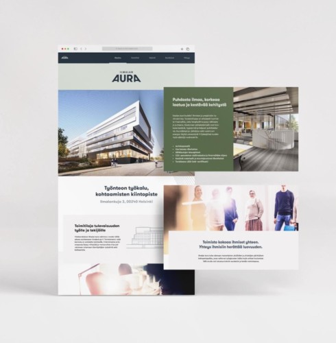
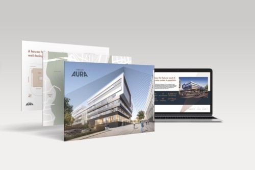
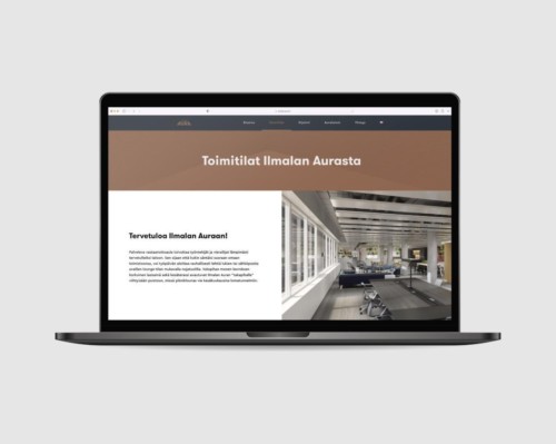
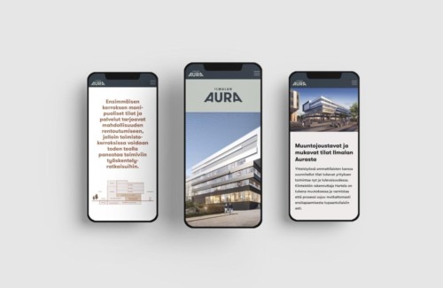
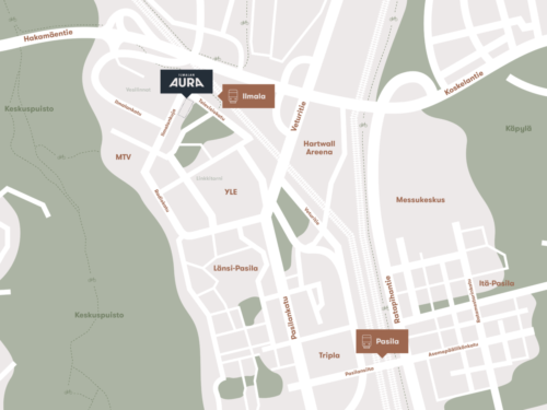
This was the premise when we started a property branding project with Hartela, a Finnish construction company strongly involved in developing the Ilmala neighbourhood.
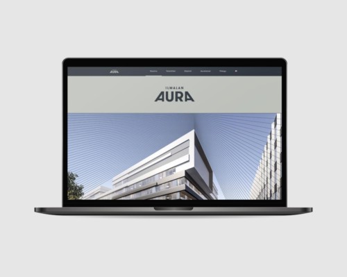
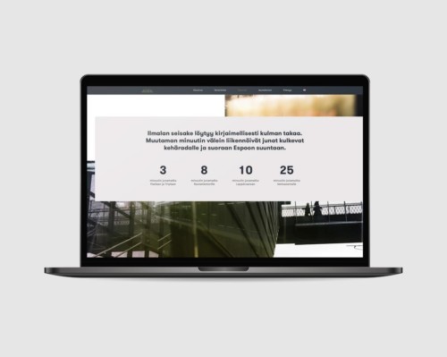
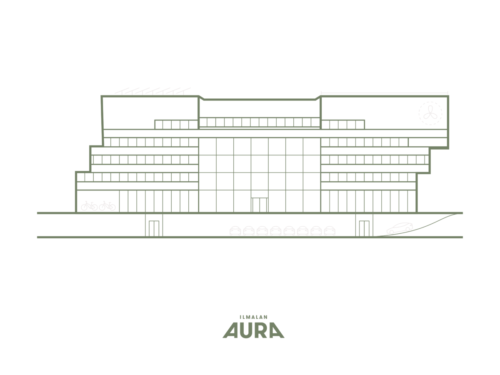
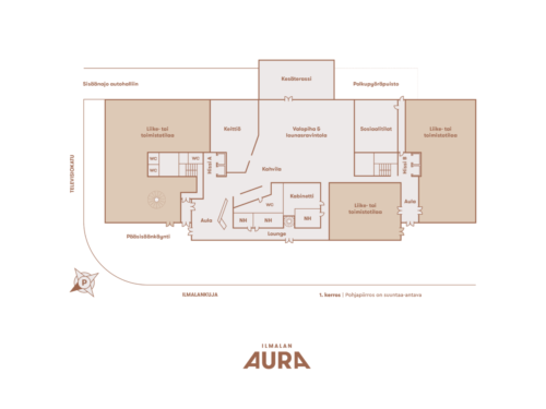
In workshops, we dug deep into Hartela offices in general as well as the development project in question. We also had discussions with the architects to get a thorough understanding of the ideas behind the design. Hartelas objectives, architects’ vision and the tenants’ needs laid the foundation for the brand, which we concretised into verbal and visual messages. After weighing several different options, we named the property Ilmalan Aura (aura = plow in Finnish). The name reflects the dynamic and propellant design as well as Hartela’s ambition to create a forward-thinking base for future work life.
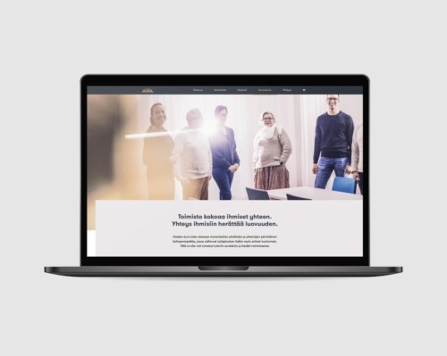
The visual identity repeats the dynamic architecture of the building and the approachability of Hartela brand offices. We conducted a photoshoot with Hartela employees to bring a more human-centred addition to the architect’s 3D images.
During the construction phase, the website will support renting and communication about the construction’s progress. In 2024, when the building is finished, the website’s contents can be modified to work as a communication platform for people working in and visiting the building.
Kakadu’s passion is to help the client succeed and prosper. Their merit is definitely agility in changing conditions, schedule management, a fresh approach and looking at things from different angles. There were some setbacks in the process, but they always cheered us on. Kakadu is definitely on the client’s side.
– Tea Hakala, Hartela
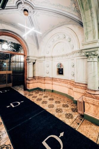


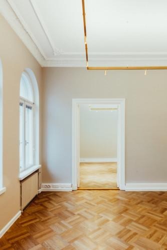
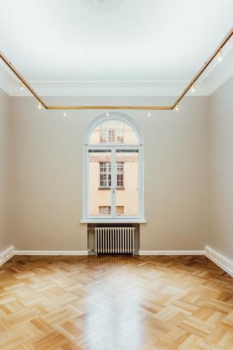
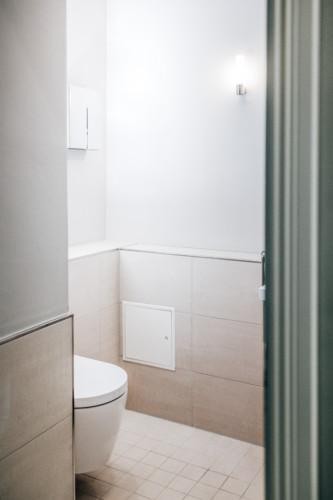
Comprehensive property development project from spatial concept to corridors
Diana Helsinki is a neo-renaissance building in the heart of Helsinki. The prestigious property went through a comprehensive shake-up, and we were more than thrilled to make use of a variety of our skills in this project.
- Spatial concept
- Property branding, website and brochure
- Interior architecture of rental apartments (Silvana)
- Interior architecture of office premises
- Corridor facelift
- Lighting design
- Signage design
Property branding
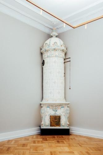
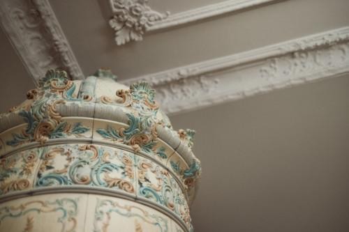
Surrounded by the parks of Central Helsinki, Diana is abundant with unique features such as decorative paintings and tile ovens. Parks, details and the adjacent statue of hunter goddess Diana inspired the visual brand.
Rental apartments
Our sibling company Silvana designed the rental apartments. Warm-hearted and neutral interior architecture creates a harmonious look for the renovated rental apartments. These unique, 1–2 bedroom homes were designed for singles and small families. Read more here.
Office premises
Tile ovens, wooden floors and stucco decorations embellish the antique premises while technical fixtures and lighting are state-of-the-art. Toilets were renovated with quality materials to last for decades to come.
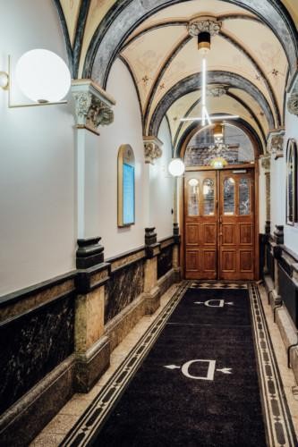
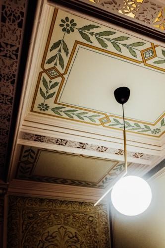
Corridors
The new, modern light fixtures create contrast with the historical architecture and illuminate the elaborate wall decorations. The stained walls got a new coat of paint, and light switches were replaced, making sure every detail was noticed.
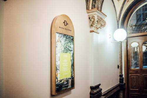
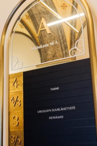
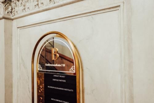
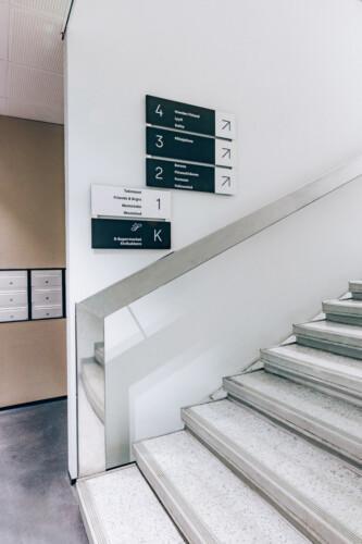
Signage
The brand identity of Diana Helsinki was brought to life in the signage. The shapes and materials follow the looks of the building, and even digital displays were cocooned in brass to make them fit in with their surroundings.
Sustainability
The whole project was steered by the environmental values of the client. We carefully considered the necessity of each step, the durability of the materials and the energy efficiency of the solutions.
Diana is a one-of-a-kind part of Helsinki, and we are proud to be part of her story.
Sustainability and Cost-effectiveness Combined
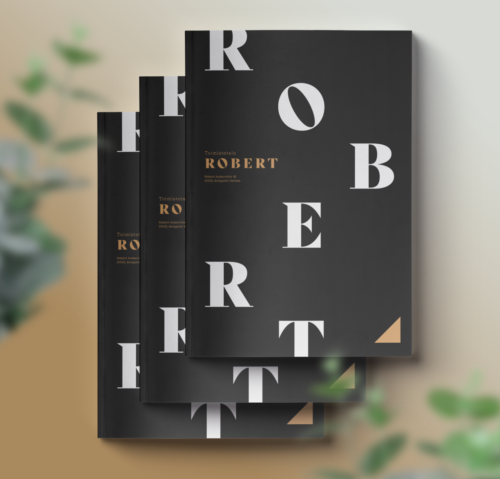
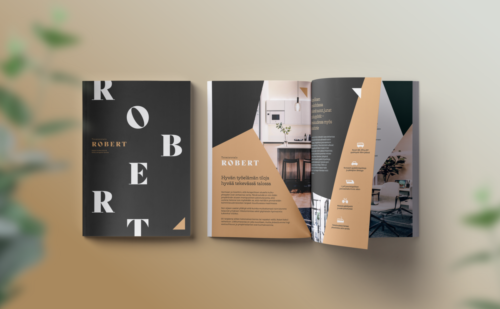
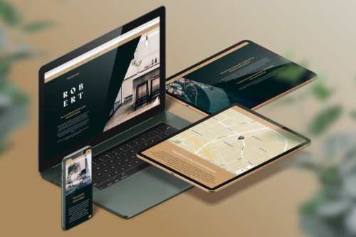
Robert is an office building located in Aviapolis, Vantaa, completed in 2019. Roberts timeless design and services support companies and their employees flowing working day experience. We were assigned to create a core message, visual identity and online marketing materials for the property.
In the brand workshop, we explored how to separate Robert from the competition in the area. The copy text communicates warmth, understanding of companies needs and sustainable values.
The newly finished building with its stylish signage gave a direction for the visual brand, which we personalised with warm tones and playful typography and shapes. We photographed the building, paying attention to its unique details; the striking floor in the lift lobby and the cosy office premises.
A high-quality and visually engaging end product is a coherent message from the website to online banners and the space itself. Robert warmly welcomes companies of all sizes to Aviapolis!
Link to Roberts website here
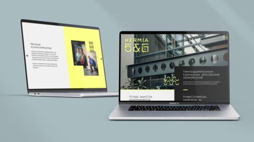

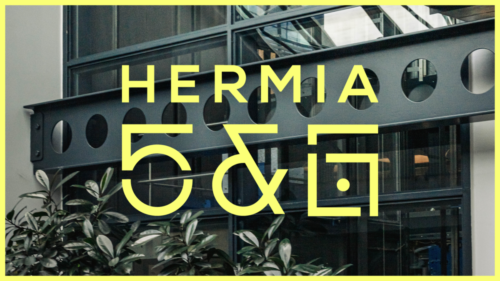
Propeller heads, synergy and rocket science
The united brand for Hermia 5 and 6 pretty much formed itself, and our job was to verbalize and visualize the story told to us by the history and current users of the property. The buildings, originally built for Nokia, have seen many faces and innovations, but the tech bubble never popped here. Propeller heads, bankers and engineers work side by side and keep up the good spirit of the two office buildings.
“The future of tech development in giants’ footprints”
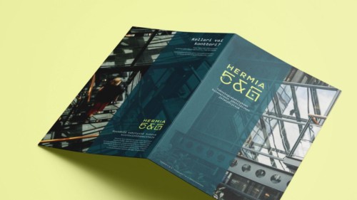
This was the starting point for property branding. We surrounded the formerly designed logo with fresh colours and graphics and used the elements to create a website, brochure and an introductory video with some drone footage.
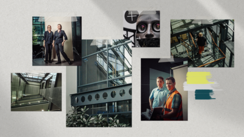
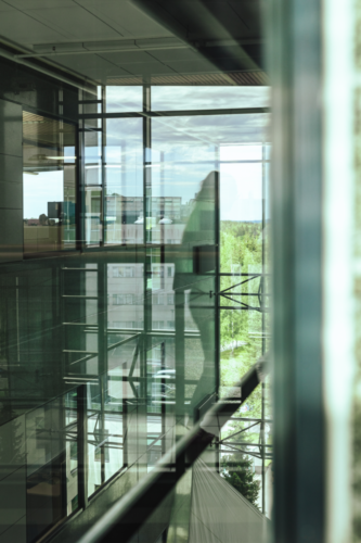
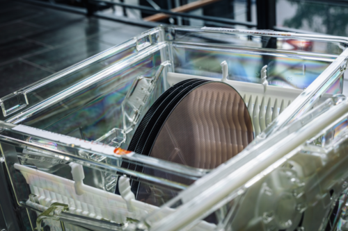
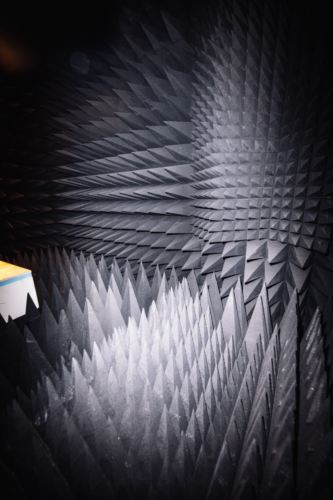
In spatial photos, the focus is on glass and steel structures typical to the era. The walls, though, were nowhere near as interesting as what happens inside them. We also visited some tenants premises and met silicon wafers, robots and an anechoic chamber on the way.
“Two buildings as a stage for engineering tour de force since the beginning of the millennium”
We also photographed the employees and tenants of the buildings. Real stories and experiences in the Hermias bring the buildings to life for future tenants as well. The core of the brand is far from far-fetched!
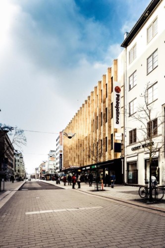
Everything you need is just a stone’s throw away.
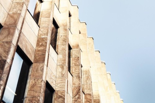
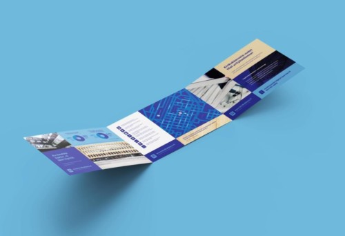
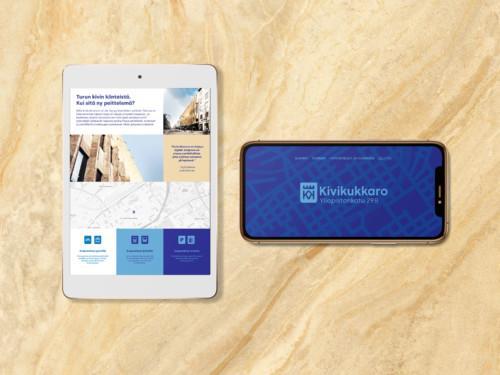
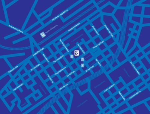
Kivikukkaro (“The Stone Purse”) is a commercial property located in central Turku’s pedestrian precinct. Our client has owned the property since 2019, and the premises have remained rented. To keep things that way, we got the assignment to get to know the property and its users.
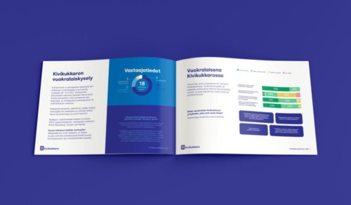
We started with an online survey for the property’s tenants in early 2021. The survey was used to understand the tenants’ experience about the property, what kind of modifications or renovations in tier perspective might be necessary, and to communicate to the tenants about the new owner.
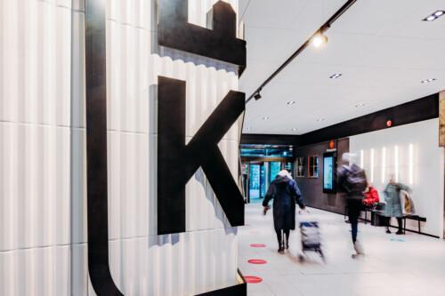
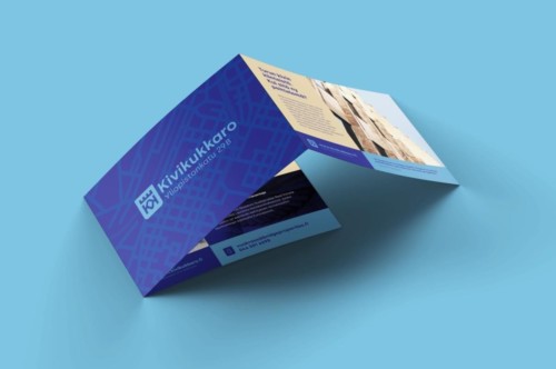
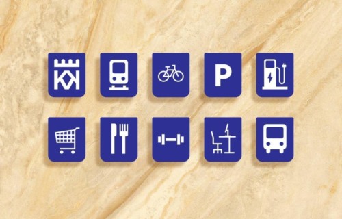
We used the survey results in property branding; central location, supermarket and parking garage came up in the tenants’ responses and were brought forward in the marketing materials. The city of Turku is seen in the logo inspired by the city’s coat of arms and heard in the slogans based on the dialect and proverbs characteristic of Southwestern Finland.
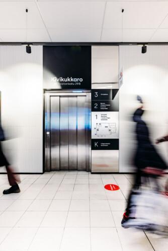
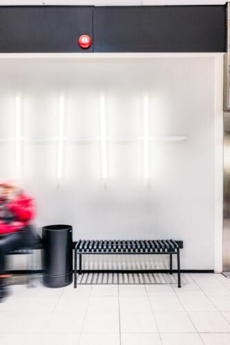
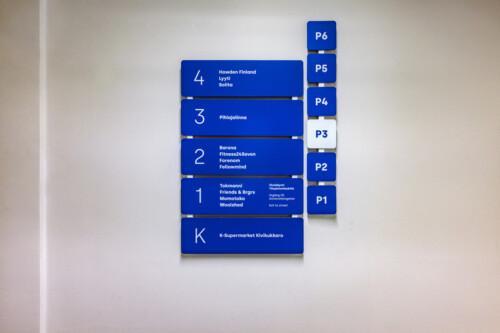
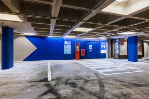
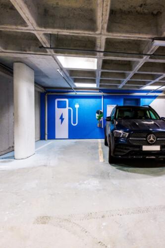
We were extensively involved in the development of Kivikukkaro. The project continued after brand design with the update of the property’s entrances and pathways, during which the property’s brand identity became an integral part of the spaces in the form of signage. The lighting of the shopping center’s entrance canopy, lobby and stairwells were updated to be more inviting, wall surfaces were refreshed, and vibrant, blue signage paintings were implemented in the parking garage spaces.
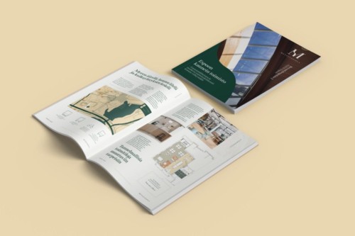
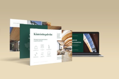
An inviting and modern office close to nature
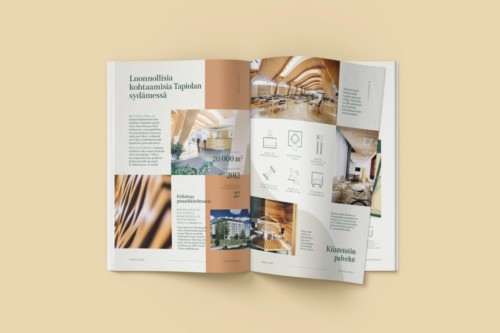
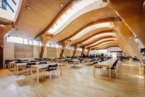
Metsätapiola, located by the forests, sea and downtown of Espoo, needed brand materials to support renting the premises. The distinctive architecture and location close to nature come together in the brand identity.
We took photographs of the interior and exterior of the building, focusing on what would be of interest to those looking to rent an office in the property. Together with Capture Design, we created 360° 3D models of the vacant premises, which are a great tool to present the opportunities of the space to a potential tenant. The brochure and the website alongside the copy text illustrate both factual and atmospherical points of view of Metsätapiola.
The brand identity extended to an easily editable PowerPoint template and office floor plans. Consistent materials strengthen the high-quality brand image of the refined property.
The project was carried out mainly online utilizing an intuitive platform, to which we uploaded designed materials as we went. The client was able to leave their comments whenever their schedule allowed, and the development of the designs was equally straightforward.
The end product is a uniform set of materials that give a profound introduction to Metsätapiola even before the first visit.