Visual communication and art
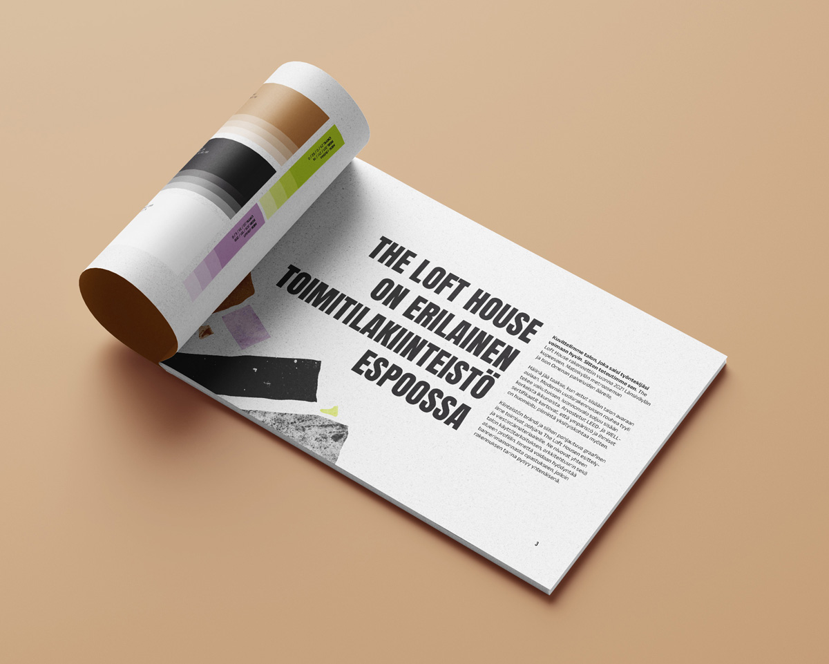
The Loft House
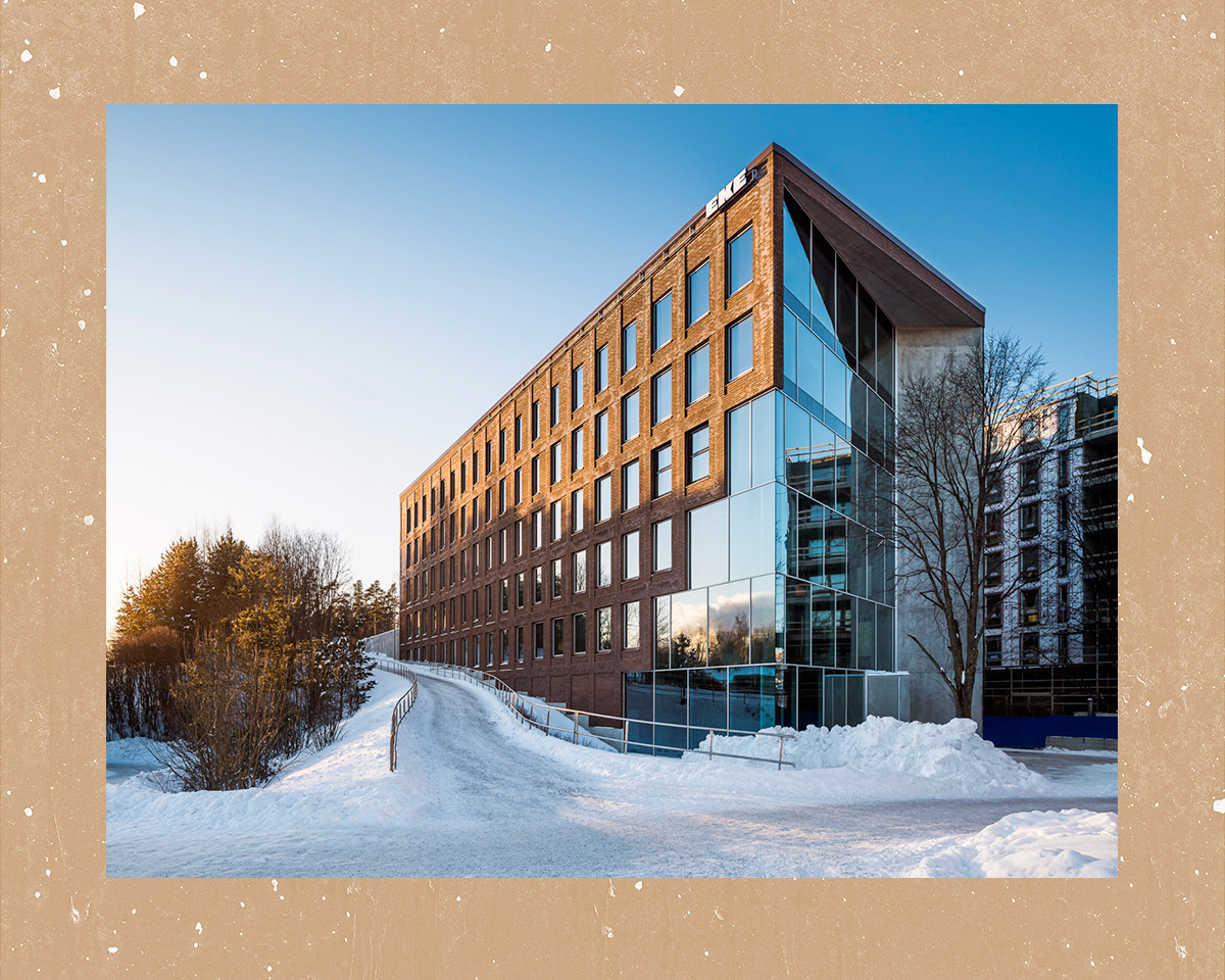
One of a kind office building in Espoo
Rugged architecture and a serene atmosphere
The Loft House is a office building completed in 2021, located next to Länsiväylä in Espoo. Architecturally striking, this new property draws inspiration from the loft style, visible in its raw concrete surfaces and large windows that bring in natural light. In addition to environmental responsibility, the building’s technical systems prioritize the health of the people working there. The Loft House is a workplace for active Espoo residents. In such a case, it’s essential for the office to provide tenants a smooth and effortless environment and support and promote their well-being. The hustle and bustle of Länsiväylä is left outside, as those entering The Loft House are greeted by peace.
Our work in this project:
- Property branding
- Visual identity
- Graphic design
- Brochure and marketing materials
- Signage design
- Patterns and vinyl tapings
- 3D visualizations
- Marketing floor plans
Visuals inspired by concrete
surfaces to balance the modern aesthetic
We designed a property brand that would bring together the above-mentioned elements naturally and confidently. The brand and its visual identity would serve as the foundation for The Loft House’s presentation and communication materials. The Loft House’s name logo is modern, simple, and straightforward. To balance it, subtle textures inspired by the property’s concrete surfaces were introduced, bringing life and lightness to the overall look. The brand typography follows the same principle: the main headline and body text fonts are straight-lined and clear, balanced by a light, handwritten script font.
The brand’s color palette is also inspired by the property and its various surfaces. Alongside clean shades of black, brown, and white, fresh pops of green and purple bring energy to the whole. The chosen color palette was intended to convey the property’s ecological and wellness-focused approach in a way that goes beyond using only shades of green. This helps The Loft House stand out from others. Just like in The Loft House itself, the brand design takes the property, environment, and people into account down to the finest detail.
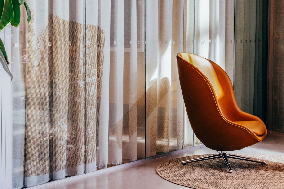
The end result is a subtle and layered entity
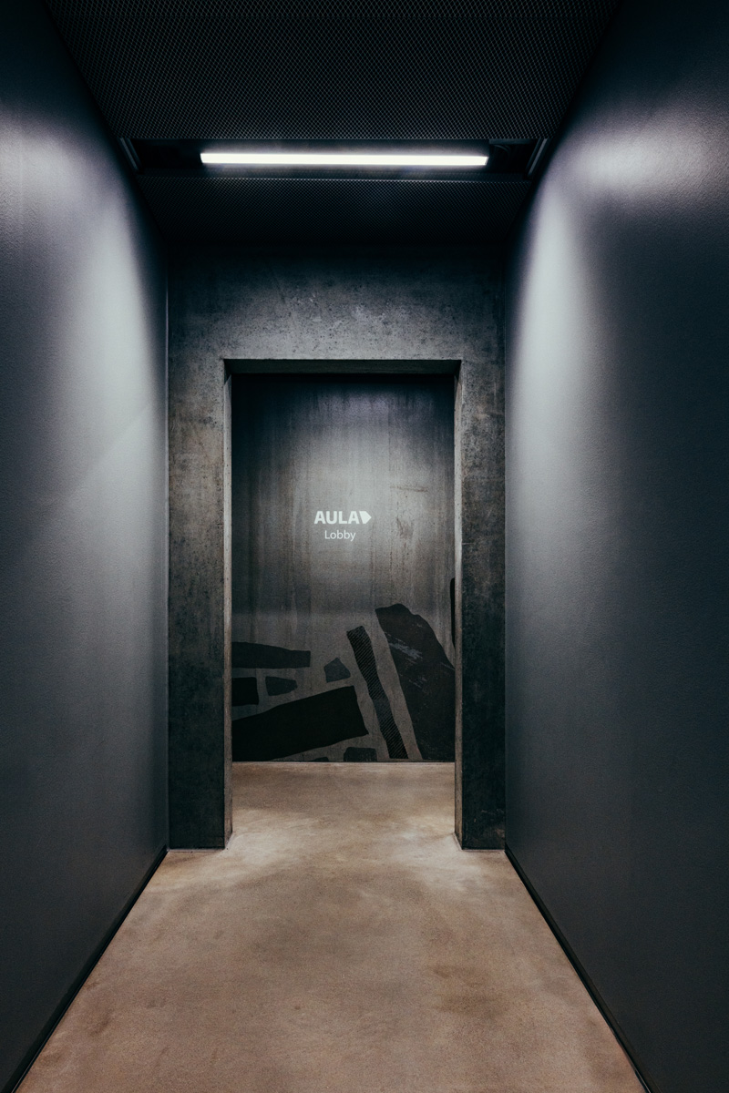
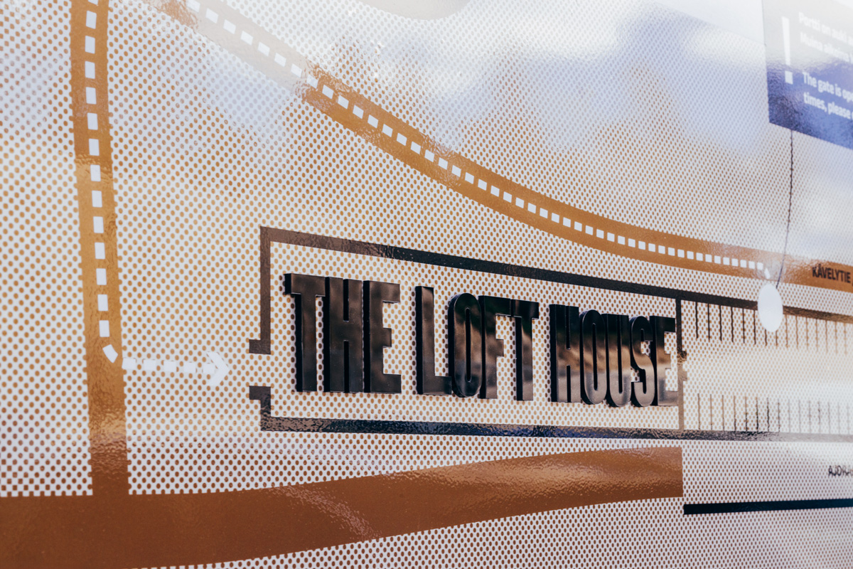
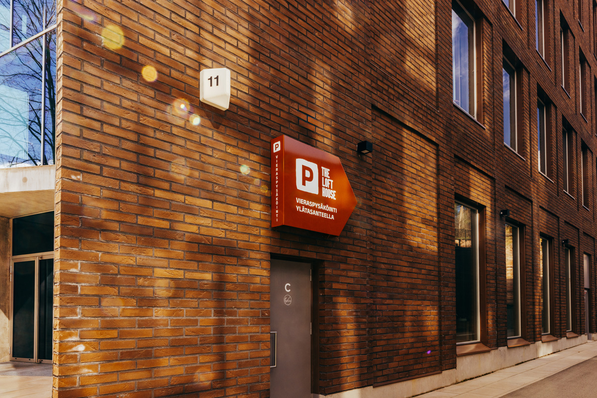
We showcased The Loft House brand through various materials implemented. The aim of the signage was to facilitate a natural flow through the property’s interiors and clarify the route from the parking lot to the building’s interior. The unique logo signs were created from corten steel for the exterior, in a shade that beautifully complements the graphic look. Inside, the design was brought to life with illuminated three-dimensional sign that guides visitors to the information desk.
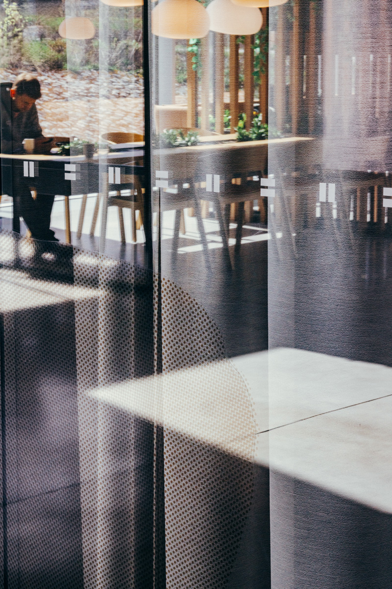
Alongside the clear directional signs leading to various spaces, we added lively graphic shapes to the interior. This playful design was installed on both window surfaces and walls, resulting in a subtle, layered entirety that flows seamlessly from communication materials to the physical space.
To support the leasing of the newly available spaces, we conceptualised 3D images of the premises and designed marketing templates as well as a high-quality, foldable printed brochure. The visualisations were designed to showcase the available premises as comprehensively as possible, while reflecting the expressive look and feel of The Loft House brand. The printed brochure was designed to further support the leasing process by providing a visually cohesive and user-friendly presentation that highlights the potential of the spaces and helps the property stand out in the market.