Visuaalinen viestintä ja taide
Revelon
Uuden kiinteistösijoitusyhtiön identiteetti
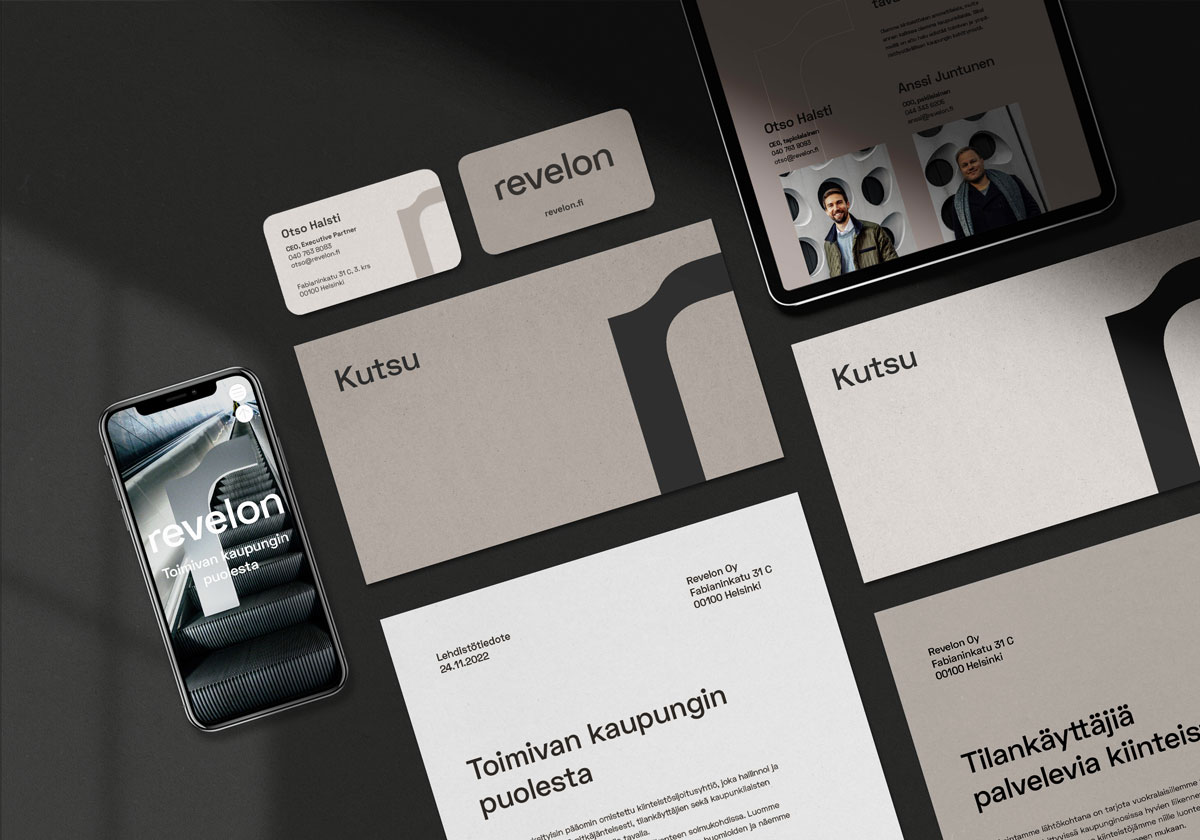
Toimivan kaupungin puolesta
Kun kokeneet kiinteistöalan asiantuntijat ottivat meihin yhteyttä identiteettisuunnitteluasioissa, olimme enemmän kuin innoissamme. Laaja-alainen toimialaymmärryksemme oli valttina, kun valikoiduimme suunnittelijaksi uuden kiinteistösijoitusyhtiön identiteetin kehitystyöhön.
Työ alkoi toimintatapamme mukaisesti työpajoilla, joista ensimmäisessä pureuduimme yrityksen toimintaan sekä arvoihin. Toisessa veimme suunnittelua askeleen pidemmälle visuaaliseen kommunikaatioon ja avainviesteihin. Työpajatyöskentelyllä autoimme myös nimeämään uuden yhtiön Reveloniksi.
Työmme tässä projektissa:
- Brändäys
- Konseptointi ja sisällöntuotanto
- Visuaalinen identiteetti
- Graafinen suunnittelu
- Työpajatyöskentely
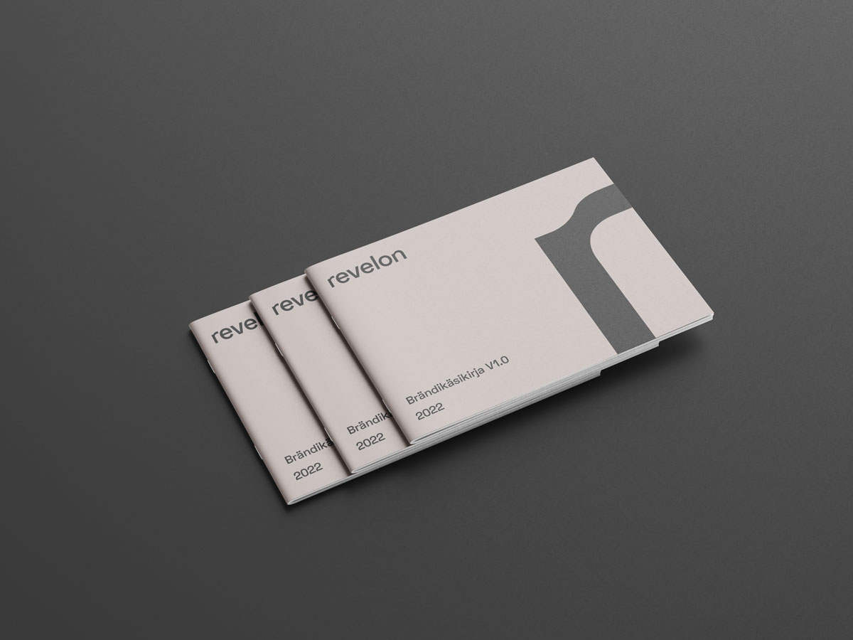
- Brändikuvaus
Selkeä aikataulu ja ketterää päätöksentekoa
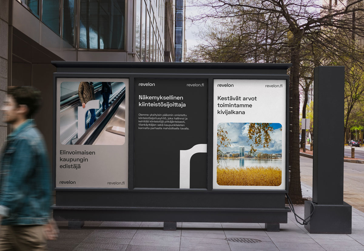
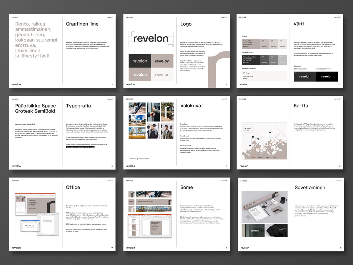
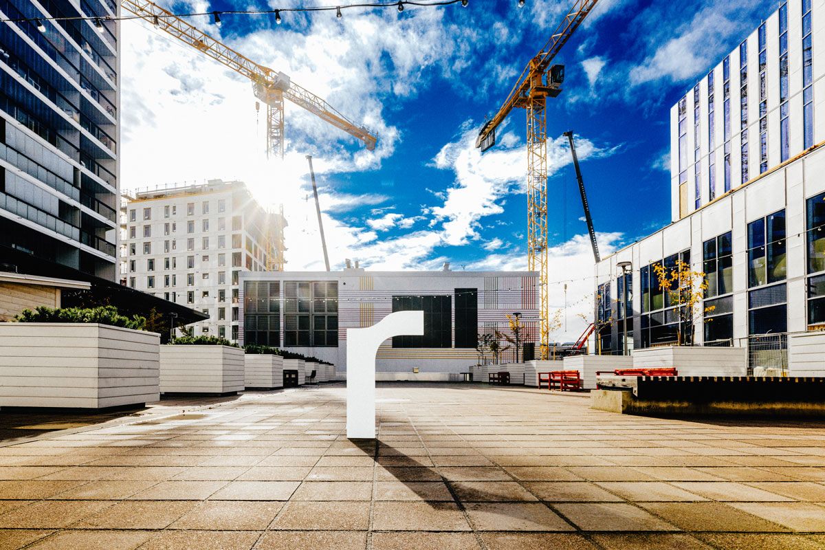
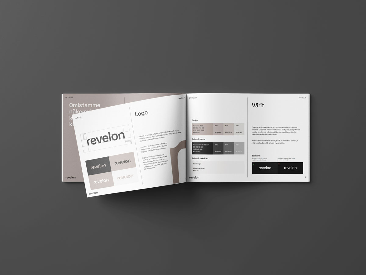
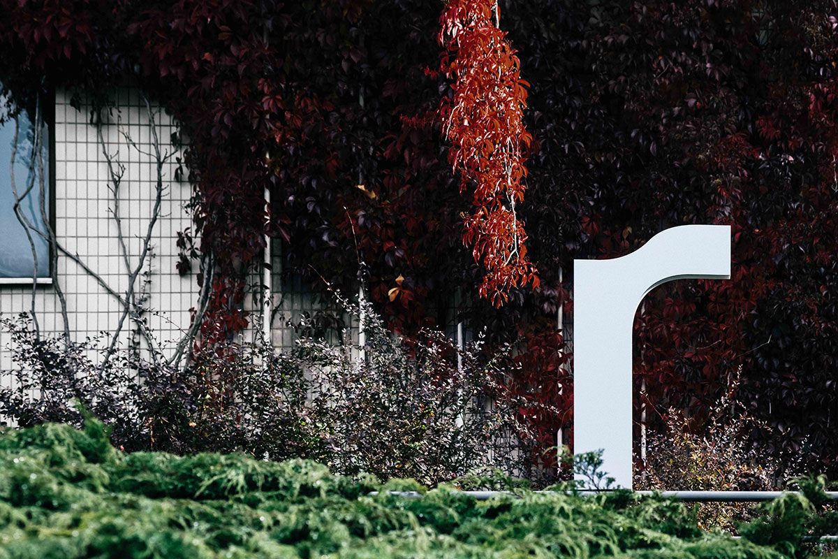
Määrittelimme identiteetille avainsanoja, kuten kokoaan suurempi, rento, ammattimainen, geometrinen, inhimillinen ja lähestyttävä. Muutamia luonnoksia yhdistelemällä saimme visuaalisen linjan, jota kannattelee vahva typografia ja harmoninen sävymaailma. Brändikuvissa Revelonin R-kirjain seikkailee kehittyvän ja luonnonläheisen kaupungin ympäristöissä pääkaupunkiseudulla.
Selkeästi määritelty prosessi aikatauluineen kehysti antoisaa projektia, joka eteni päämäärätietoisesti suunnittelun alusta loppuun asti. Molemminpuolinen luottamus, yhteisymmärrys ja asiakkaan ketteryys päätöksenteossa toivat varmuutta tekemiseen, jonka lopputuloksen takana sekä suunnittelija että Revelon voivat seisoa ylpeästi.
Kakadun kanssa oli ilo työskennellä ja brändityön lopputulos ylitti odotuksemme. Yhteistyö oli koko ajan sujuvaa ja käytännönläheistä.
Otso Halsti, toimitusjohtaja, Revelon